In this step-by-step guide, learn how you can create a Trello-like project management app quickly and easily using Kendo UI.
This is the first post in a two-part series where you will learn how to build the frontend for a Trello-like app. Our app will have a board with lists and the lists will contain cards. The cards can be dragged and dropped within their list or between lists. And users can create new cards as well as edit the content of existing cards. This kind of app can be customized for many different uses cases like a project management tool for software developers or an issue tracker. Our app will be a todo list built using the Kendo UI ListView and Sortable components. Your first task will be to create a board initialized with three lists and a few cards.
Creating the Lists
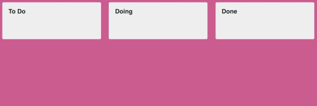
Our board is essentially a list view within another list view. The first list view we will create are the containers for the cards. We will create an element with the id board in the body of our HTML to inject our lists. Inside the component’s parameters, we will specify the data source and the template to initialize the widget. Our dataSource will be an array of objects that have a listID and name attribute. This example creates three lists:
<!DOCTYPE html><html><head><metacharset="utf-8"><title>Kanban Board</title><linkrel="stylesheet"href="https://kendo.cdn.telerik.com/2018.3.911/styles/kendo.bootstrap-v4.min.css"><scriptsrc="https://code.jquery.com/jquery-1.12.3.min.js"></script><scriptsrc="https://kendo.cdn.telerik.com/2018.3.911/js/kendo.all.min.js"></script></head><body><divclass="board"></div><script>$('.board').kendoListView({
    template: kendo.template($('#listTemplate').html()),
    dataSource:[{listID:0, name:'To Do'},{listID:1, name:'Doing'},{listID:2, name:'Done'}]});</script></body></html>
The list template will have a header that displays the value of the name attribute. Beneath the header will be a container to hold the list of cards. This container will have an id that uses the value of the listID attribute. For our example, if the listID is 1 the element’s id will become list-1. We need to give this element an id so we can reference it when creating the list view for the cards later on. The following is an example of the board’s list template created using a script block. It should be placed before the script where your component is initialized.
<scriptid="listTemplate"type="text/x-kendo-template"><div class="list-wrapper"><div class="list-header"><span class="list-title">#: name #</span></div><div id="list-#: listID #"class="list"></div></div></script>And this is the associated CSS to style the lists:
<style>body {font-family: helvetica;color:#444;}.board{overflow-x: scroll;white-space: nowrap;position: absolute;top:0;right:0;bottom:0;left:0;background:#cd5a91;}.list-wrapper{width:16em;background-color:#eee;margin:.5em;border-radius:3px;box-sizing: border-box;display: inline-block;vertical-align: top;}.list{background-color:#eee;border: none;padding:.5em;margin-bottom:2em;box-sizing: border-box;}.list-header{height:3em;line-height:3em;padding:01em;}.list-title{font-weight: bold;}</style>Creating the Cards
Next, we will create a ListView for the cards. A card will have a cardID and a name. The name is the content that will be displayed inside the card. The first step is defining the template. Again, we will use a script block that’s placed in the body of the HTML.
<scriptid="cardTemplate"type="text/x-kendo-template"><div class="card">#: name #</div></script>And this is the additional styles:
.card{box-sizing: border-box;position: relative;width:100%;min-height:4em;padding:1em;border-radius:3px;margin-bottom:.5em;background:#fff;}For each list in the board, we will create a list view for the cards. We could create a function to loop through the data and create the components. This would be ideal if we had a variable number of lists. For instance, if we allowed users to create lists as well, then we would not be able to hard code each component. We would need to dynamically create the lists and find which cards belong to each list to insert them into the list view. However, since we are working with a fixed number of lists, I will define each component manually.
$('#list-0').kendoListView({
  template: kendo.template($('#cardTemplate').html()),
  dataSource:[{ cardID:0, name:'Create UI'}]});$('#list-1').kendoListView({
  template: kendo.template($('#cardTemplate').html()),
  dataSource:[{ cardID:1, name:'Implement button behavior'},{ cardID:2, name:'Refactor code'}]});$('#list-2').kendoListView({
  template: kendo.template($('#cardTemplate').html())});
This is now what our board looks like:
Making the Cards Sortable
To make our cards draggable and droppable between lists we will use the Sortable component. Each of these list views will behave the same so we can give them all the same options. First, we will create a variable named sortableOptions that we will pass to the component’s arguments.
var sortableOptions ={
  filter:'.card',
  container:'.board',
  connectWith:'.list',
  cursor:'grabbing',
  placeholder:function(element){return$('<div class="card"></div>').css({
      background:'#ddd'});},
  hint:function(element){return element.clone().css({
      width:'15em',
      transform:'rotate(-5deg)',
      border:'1px solid #eee'});}};
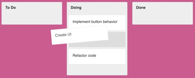
The filter option is needed to define which items are sortable. The connectWith option lets us move the cards between the lists. Our placeholder is an empty card element that is slightly darker than the background to give the appearance of a shadow where the card was moved. And the hint is a copy of the card element given a slight tilt. The final part is to initialize each card list view as a Sortable component.
$('#list-0').kendoSortable(sortableOptions);$('#list-1').kendoSortable(sortableOptions);$('#list-2').kendoSortable(sortableOptions);This is what the board looks like while dragging a card:
Summary
So far we have created a list view for the lists on the board and the cards in the lists. We also made the cards sortable so we could move them around the lists. We could have also made the lists sortable using much of the same code from the card sortable options. The main fields you would need to change is the filter option so that it uses the container for the lists and the hint can be a clone of the element.
Stay tuned for the next article, where we will implement the behavior to add, edit, and remove cards.
Try out Kendo UI for Yourself
Want to start taking advantage of the more than 70+ ready-made Kendo UI components, like the ones here? You can begin a free trial of Kendo UI today and start developing your apps faster.
Angular, React, and Vue Versions
Looking for UI component to support specific frameworks? Check out Kendo UI for Angular, KendoReact, or Kendo UI for Vue.