In this third installment of Jessica Engstrom's five-part series on UX principles for developers, she explores the concepts of responsiveness and efficiency.
If you missed my previous posts, you can catch up right here: Part 1: Make Software Understandable and Part 2: Ergonomics & Beauty. Otherwise, let's dive into part 2 below.
Responsiveness
Is there anything more frustrating than a page or app that doesn’t seem to respond to your interactions? Well, there probably are but it’s still a source of many rage-quits.
For me this is very important, we might have the most beautiful design where you thought about the user experience everywhere else. But if we lose our users because our solution isn’t responding or is very slow, there’s a risk our users won’t stay for all the other good stuff.
Human reaction time is somewhere between 85-300 milliseconds depending on the circumstances. We can take that into consideration and look at some ways of preventing the feel of slow or non-responsive software.
For example, within 100-300 milliseconds of user activation provide a confirmation like the button looks pressed. Within 500 milliseconds respond to any tasks that the user deems easy to perform like page down, zoom, minimize window.
If our task takes more than one second, give continuous feedback, like a spinning wheel or progress bar. If our task takes more than two seconds, make sure the continuous feedback you are giving keeps updating every 2-5 seconds, so our users don’t think the solution has frozen.
Unexplained waits always seems longer than explained waits, even though we don’t tell the user that we are really getting the data from a database or loading graphics it will still be an explanation of sorts.
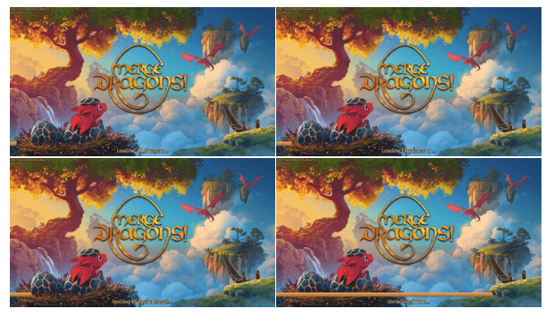
The game Merge Dragon has a cute way of solving their loading times (see the captions, listed below).
 “Loading all dragons,” “Loading emoticons,” “Igniting Dragon’s breath,” “Unraveling time”
This has of course nothing to do what is happening, but it gives the user an indication that something is happening and gives them a perceived sense of speed.
Efficiency
Something else we as humans like, especially in today’s stress-inducing society, is being efficient.
Having to do workarounds or far too many steps is not something that most of us enjoy. That’s why we need to make our user interface feel more efficient. It doesn’t necessarily have to be fewer steps if the user perceives it as more efficient.
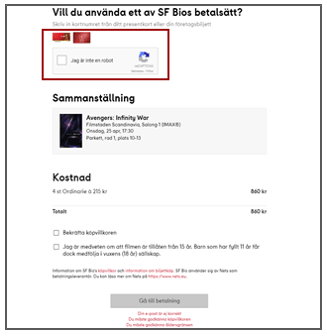
 This is what it looks like when you want to order movie tickets in Sweden
I have put in a prepaid ticket number (kind of a gift card) and I’m prompted to proove that I’m not a robot.
That’s okay, but in my case I want to order four tickets the same way, and I’m prompted four times. If I wasn’t a robot 30 seconds ago, I’m probably not a robot now either. Imagine when I ordered tickets to see the latest Star Wars movie, we were 18 friends who were going. 18 times I was not a robot. A more efficient way of asking would be to let me fill in all the prepaid numbers and THEN ask me once.
Another thing that might take away from the efficiency of our UI is when we put too much information on the same screen. Don’t get me wrong, information is good for comprehension, but keep it simple.
If there is too much to look at, we might not see the most important things. See if you can sort things into groups or pages instead. Or just boil all the information down to the very essentials.
Remembering things about our users can also increase efficiency. If the user has already given us information, rather than prompting for it again, just get the information from storage. For instance if our users signs in to our service using their email address and then clicks “contact us” or “sign me up for emails,” use the email you have and pre-fill the form and ask “do you want to use this email” instead of just prompting them to fill in their email again.
Making it as efficient as possible and showing the user that you tend to their interaction will make all the difference in the user experience.
Stay tuned for the next post in this series, or for more, feel free to check out the webinar we recently hosted on the topic right here.