The MultiColumnComboBox was one of the most requested items we've ever had in our feedback portal. Let's take a closer look at what it can do and how you can use it in your apps today.
It has been a couple of months since the R3 2018 release of Kendo UI, and while the buzz of the release has gone down a bit I wanted to stop and take the time to go through one of the biggest pieces to come out of R3 2018: the new MultiColumnComboBox component for the jQuery, ASP.NET MVC, and ASP.NET Core UI component libraries!
This was one of the highest requested items ever to come through the Kendo UI feedback portal, so the Kendo UI team was very excited to be able to deliver this to all of our developers. We've already seen quite a few of you pick up the component and start using it, but for everyone else here's an overview of exactly what the component is, why it exists, and (hopefully) some inspiration for how to use it in your applications today!
What is the MultiColumnComboBox?
While the name certainly is a mouthful to say it is also very descriptive and immediately lets you know what the component is all about. The MultiColumnComboBox is a ComboBox with the ability to show its data in multiple columns. Simple, right? Another way to think of this is offering a grid-like layout within a drop down.
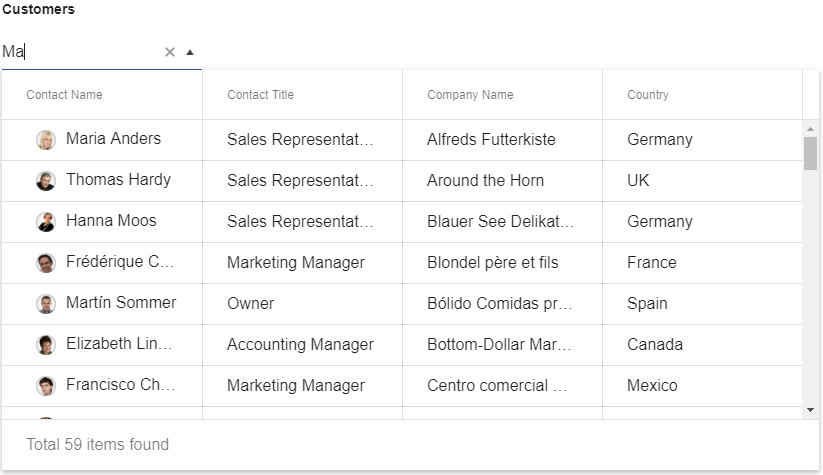
While it may not fit for every application, there are certainly scenarios that call for saving real estate (through the drop-down) with the ability to show many values for a particular item, rather than just a single value for a data item (through the grid structure). It was, after all, one of the most-voted for items that we ever had in our public feedback portal!
How Do I Start Using the MultiColumnComboBox Today?
The first place to start with any of our DropDowns is with an input element, since this is the base HTML element that we are looking to enhance with additional functionality.
<input id="customers" />
From there, we can use some of the magic that comes from Kendo UI by making this into our new component. In this sample I'm using document.ready, but you could of course instantiate the component somewhere else.
<input id="customers" />

<script>
  $(document).ready(function() {
    $("#customers").kendoMultiColumnComboBox();
  });
</script>
This really just renders an empty component, so now that we've created the basic component lets add in some data. In this particular case I'm going to work with the Kendo UI DataSource framework item and bind to one of our publicly available sample OData endpoints.
Building out the sample a bit more we get the following:
<input id="customers" />

<script>
  $(document).ready(function() {
    $("#customers").kendoMultiColumnComboBox({
      dataSource: {
        type: "odata",
        transport: {
          read: "https://demos.telerik.com/kendo-ui/service/Northwind.svc/Customers"
        }
      }
    });
  });
</script>
We're getting somewhere, but we're not quite there yet. If we run this we just get a list of [object Object] that contains as many items as we have in our data store.
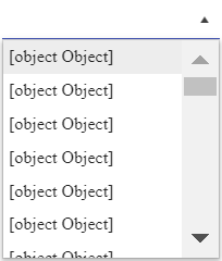
The way to tweak this is to define a dataTextField and a dataValueField which, as you may have guessed, lets the component know what text should be displayed within the input (TextField) and what the underlying value should be (ValueField). Of course, we can pull information from the entire data item, but we want to adhere to some of the basics of an input element here.
<input id="customers" />

<script>
  $(document).ready(function() {
    $("#customers").kendoMultiColumnComboBox({
      dataTextField: "ContactName",
      dataValueField: "CustomerID",
      dataSource: {
        type: "odata",
        transport: {
          read: "https://demos.telerik.com/kendo-ui/service/Northwind.svc/Customers"
        }
      }
    });
  });
</script>
This will just take [object Object] and display a single column which is just like our regular ComboBox. Where are all of our columns!? Well, for the MultiColumnComboBox we decided that it would be best to define columns similarly to how we do in the Grid and TreeList: with the columns configuration option. This is an array of objects that represent our columns, including defining what field we're binding to and what the title of the column should say.
If you've ever worked with the Kendo UI Grid you should be very familiar with this structure!
<input id="customers" />

<script>
  $(document).ready(function() {
    $("#customers").kendoMultiColumnComboBox({
      dataTextField: "ContactName",
      dataValueField: "CustomerID",
      columns: [
        { field: "ContactName", title: "Contact Name", width: 200 },
        { field: "CompanyName", title: "Company Name", width: 200 },
        { field: "Country", title: "Country", width: 200 }
      ],
      dataSource: {
        type: "odata",
        transport: {
          read: "https://demos.telerik.com/kendo-ui/service/Northwind.svc/Customers"
        }
      }
    });
  });
</script>
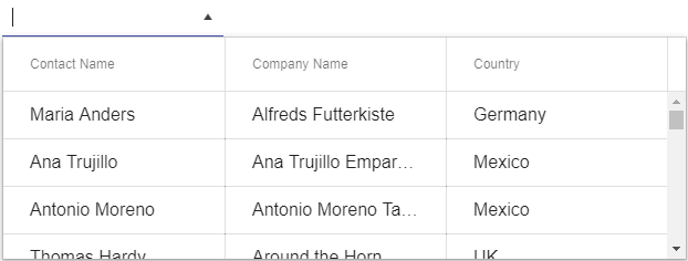
Now we are getting somewhere! Our drop-down renders, and it displays the columns that we have defined - including the headers! Users can interact with items and select them to have them appear in the input element after being selected. However, we don't have a way to filter items down based on what the user types in, something that we've all grown accustomed to by now to manage these potentially huge lists.
Letting users filter the input is handled by two configuration options: filter and filterFields.
The filter lets us set what type of filter we want do deal with. This includes options like "starts with" and "contains" which are probably the most popular, but a few more options can be used.
The filterFields is a bit unique as this allows us to explicitly define what columns we want to search across. So, if we want to limit this down to just one or two columns we can do so by only mentioning these items in the array. Note however that you can add in all of your fields if you want to!
So, if I want to filter across all fields from the previous sample and have the filter operate as a "contains" all I need to do is add these two configuration options to the above sample.
<input id="customers" />
<script>
  $(document).ready(function () {
    $("#customers").kendoMultiColumnComboBox({
      dataTextField: "ContactName",
      dataValueField: "CustomerID",
      columns: [
        { field: "ContactName", title: "Contact Name", width: 200 },
        { field: "CompanyName", title: "Company Name", width: 200 },
        { field: "Country", title: "Country", width: 200 }
      ],
      filter: "contains",
      filterFields: ["ContactName", "ContactTitle", "CompanyName", "Country"],
      dataSource: {
        type: "odata",
        transport: {
            read: "https://demos.telerik.com/kendo-ui/service/Northwind.svc/Customers"
        }
      }
    });
  });
</script>
And that's it! Now we have our very own MultiColumnComboBox that displays all of our data fields that we're interested in and allows us to filter items across any of our fields.
Some Feature Highlights
Virtualization
Often we see many of our users throwing a ton of data in to their drop-downs, which isn't necessarily a bad thing! Having the ability to somehow tie all your data in to this kind of UI component makes a lot of sense, but often times this leads to a LOT of extra HTML being generated (it has to be rendered somewhere after all) and it can create quite a slow experience even in the faster browsers.
This is why we added in virtualization from the get-go in to the MultiColumnComboBox. It allows us to bind to the full list of data and pull in this data as its needed from the server (I don't think we need 100,000 records to be displayed all at once in a drop-down ![]() ) and have improved mechanics around scrolling. This not only saves on initial load time, but any level of scrolling that needs to be done.
) and have improved mechanics around scrolling. This not only saves on initial load time, but any level of scrolling that needs to be done.
Server Filtering
In the sample that we walked through in this blog post we ended up loading all of the data available from the REST endpoint that we are reading data from. This, however, can prove to be quite tricky to handle if we have hundreds of thousands of records (especially in older browsers) so we may want to lean on server filtering for these data heavy scenarios.
Server filtering gives us the ability to request data once a user has typed in a certain amount of characters (defined by the minLength property) and go to the server to perform the filter options and return the appropriate list of items. Tie this in with the autoBind configuration option which can prevent the MultiColumnComboBox from binding data until a request is bade later and you have a great combination for offloading data intensive activity to the server rather than the client.
An example if this can be found right here.
Grouping
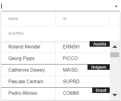
Just like with our ComboBox we added in the ability to organize your data items in groups. This can easily be done by following the example in this demo, and as the quick screen grab above showcases, this provides us with a little indicator of which particular group the data items displayed are a part of. This, by the way, is pulled from the DataTextField value of the field we're grouping on.
Templates
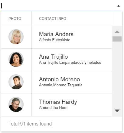
So far we've really only talked about handling text in columns, but what if we want to customize each entry to update its look based on the data item, or just have some additional HTML added for each item? Well, this is where templates come in! As can be seen in this demo, dealing with templates is done on a column-by-column basis, and allows for both the cell and header to take advantage of any kind of custom template.
There's More!
I tried to walk through some of the most-used features that come from some of our other drop downs (mainly the ComboBox), but there's a ton of other features that we can use this new component in. We highly recommend that you take a look through both our demos as well as our documentation to see what else is available.
Feedback
This initial release of the MultiColumnComboBox had quite a lot of features from the initial release, but that doesn't mean we're done with it! If you have any suggestions on how we can improve this component do not be shy! Feel free to use the comment section below, or submit this as a feedback item in the Kendo UI feedback portal.