I found this lovely animation online and cleaned it up a bit for a Secret Santa app me and my husband worked on for the holidays. However, we had to comment out the animation and Christmas tree because it was causing our older MacBook laptop to crash. Not that my newest MacBook fared much better, the fans sounded like we were prepping to go into outer space when the animation ran for more than a few minutes.

The animation, a Christmas tree and snow drawing, are obviously not performant—so much so that we can’t even use them. I wanted to go over the different options we have. Do we even have other options? Can we even animate without crashing browsers in this world of 2018?
The answer is, of course, yes. It simply takes some awareness rather than a haphazard slapping around of animations.
Here is the starting StackBlitz.
The Problem
If we check out the performance panel in our devtools for Chrome, we see bottlenecks in our load time! You're probably asking (in your best enraged angry developer voice), “What could cause this?!” Well, turns out our animations are no bueno. With CSS in modern browsers, you really only have four options when it comes to animating with no problems. As the great Lewis and Irish say in their article, “High performance animations”:
Modern browsers can animate four things really cheaply: position, scale, rotation and opacity.
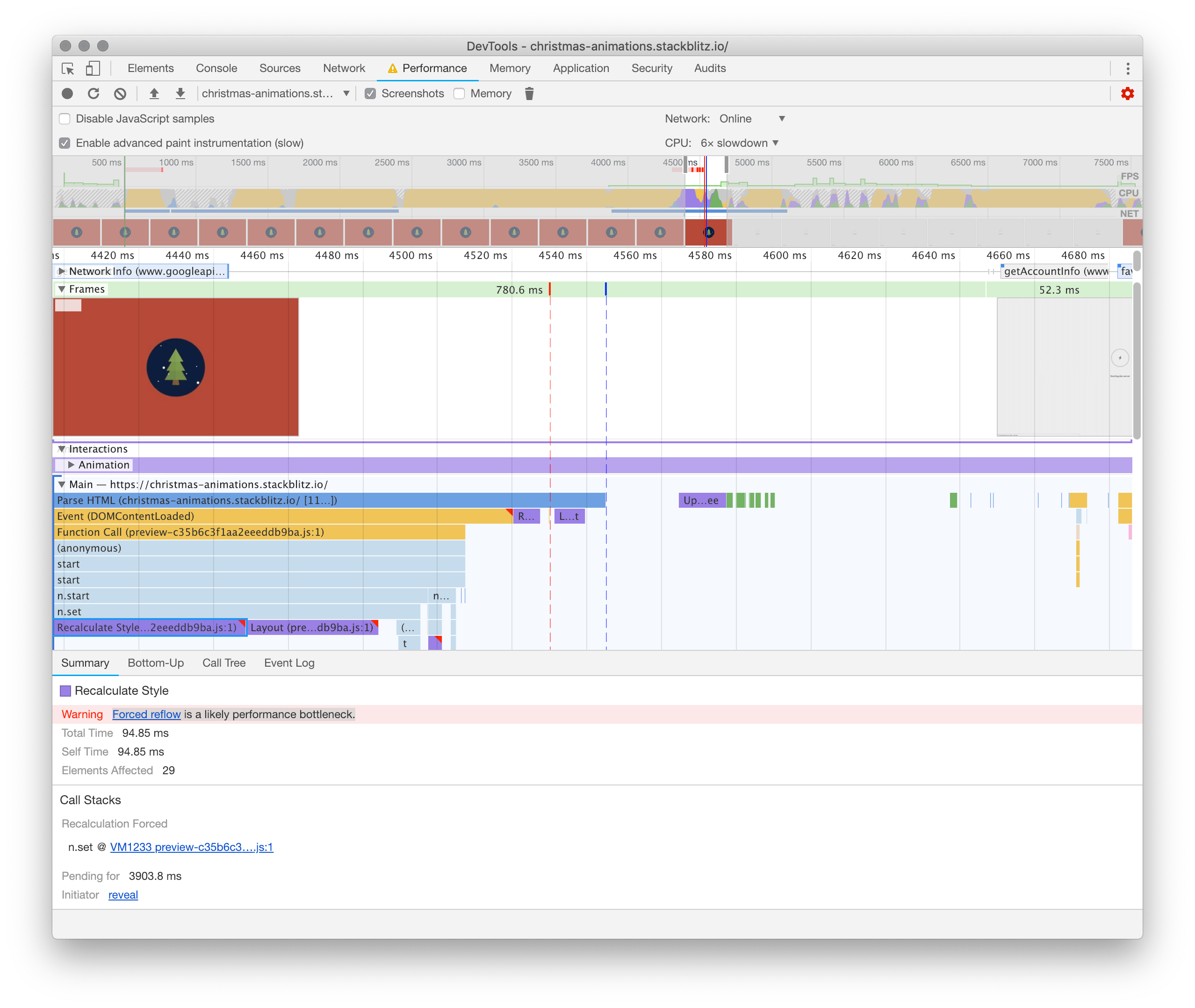
I slowed the CPU down six-fold to attempt to simulate a chugging MacBook (I would have put it lower if I could have). This particular bottleneck is taking 94.85 ms. Yes, that is just milliseconds, however, if we take longer than 16 ms to render a frame, the people will notice. In terms of frames per second, users like to have at least 60 FPS. When our tree first loads with the “bad” animation, we are getting a horrifying 10 FPS:
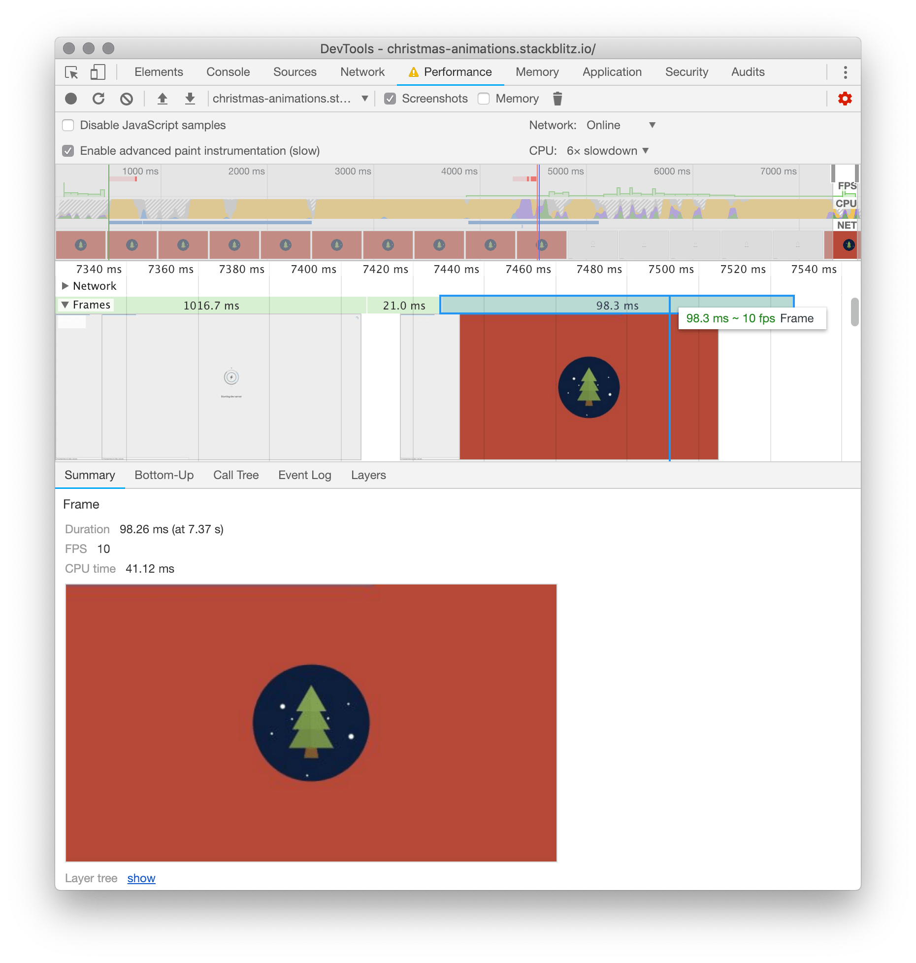
At some points though, like in our bottlenecks above, we are getting 0 - 1 FPS. This is pretty unacceptable, even with the GPU performing at six times slower. All of our tests will be ran at 6x slower, even our final performant code, to compare evenly.
The Solution
As I briefly mentioned before, when it comes to animating cheaply in modern browsers today, we really only have four options.
Modern browsers can animate four things really cheaply: position, scale, rotation and opacity. — Paul Lewis& Paul Irish
Right now, we are animating the snow down the screen with background-position.
// tree.scss

animation: snowing 40s linear infinite forwards;
@keyframes snowing {
  100% {
    background-position: 0px ($size - 4px), 0 ($size - 4px), 0px ($size - 4px), 0px ($size - 4px);
  }
}
Note: They skipped the 0% or beginning part of the keyframe. It will be assumed the starting or default position of the snow.

If you are ever pondering “exactly how good/bad is this CSS change on my browser,” check out CSS triggers to find out. (This is where the above image is from.) So we know that animating background position is not optimal. Our next obvious choice is to replace this with a transform translate. Translate allows you to move DOM elements on their X and Y axis.
// tree.scss

animation: snowing 40s linear infinite forwards;
@keyframes snowing {
  0% {
    transform: translate(0,-$size);
  }
  100% {
    transform: translate(40px, calc(#{$size} - 30%));
  }
}
Our snowing keyframe has two simple steps. The first one starts the snow off at 0 on the X axis and -$size on the Y. Currently we have the size set to 400px. So the snow will start 400px above where it would originally be.
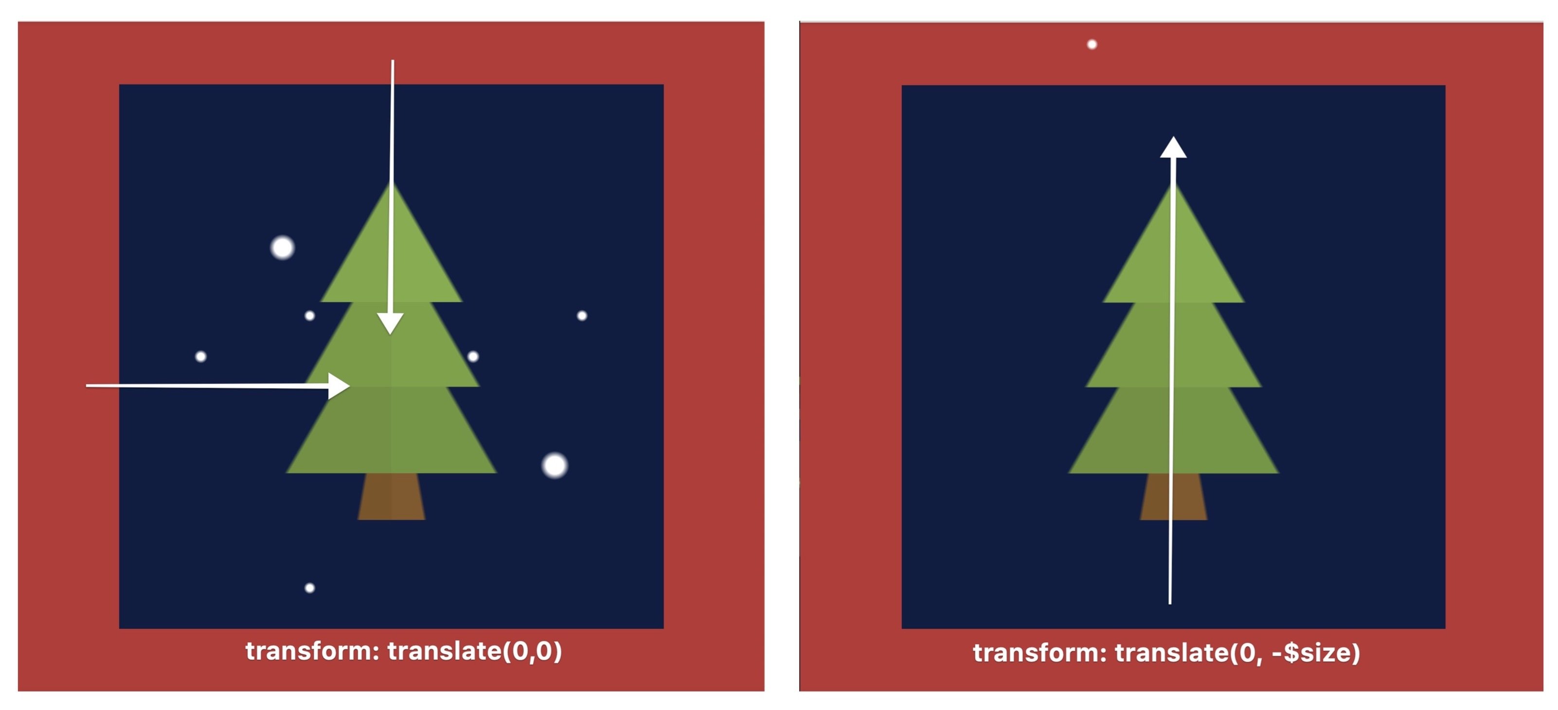
Note: The border-radius and overflow-hidden have been commented out for these screenshots, to better demo where the snow is.
The end of our animation:
transform: translate(40px, calc(#{$size} - 30%));The last and final step is telling the snow to end 40px to the right and 30% less than the full size of the .christmas scene down. We are setting it at 30% less than the full height in order to match the highest snowflake:
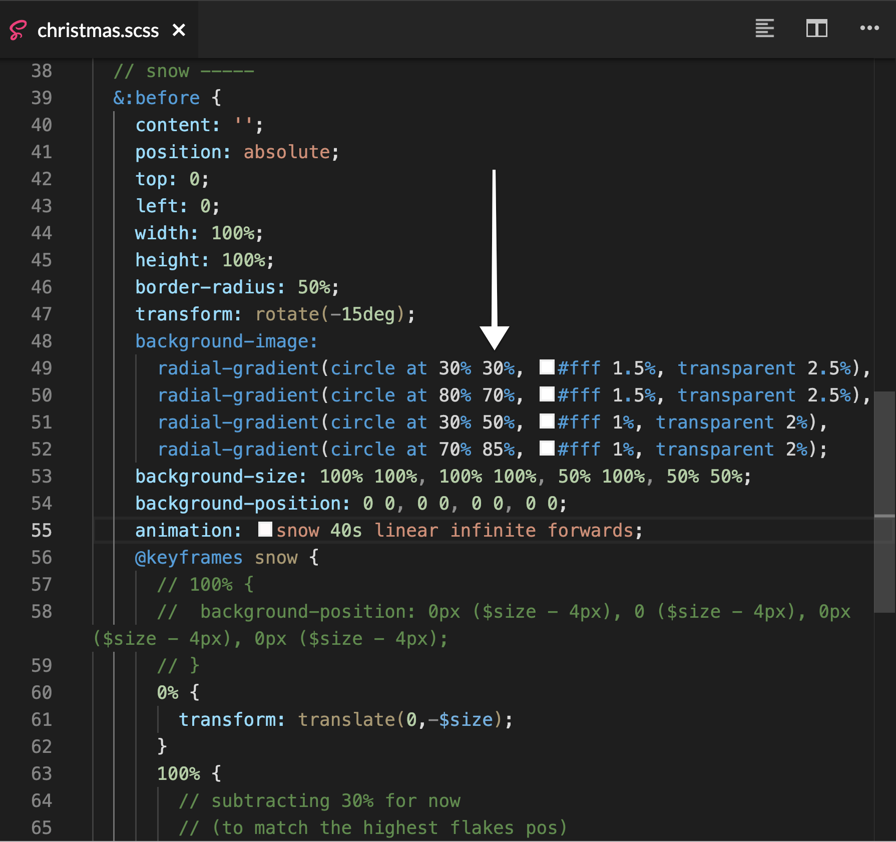
I’ve sped up the animation here to show you the loop we just created:

Apologies for the seemingly “chunky” GIF, check out this specific StackBlitz to see the sped up snow live.
Performance Check
Before
After
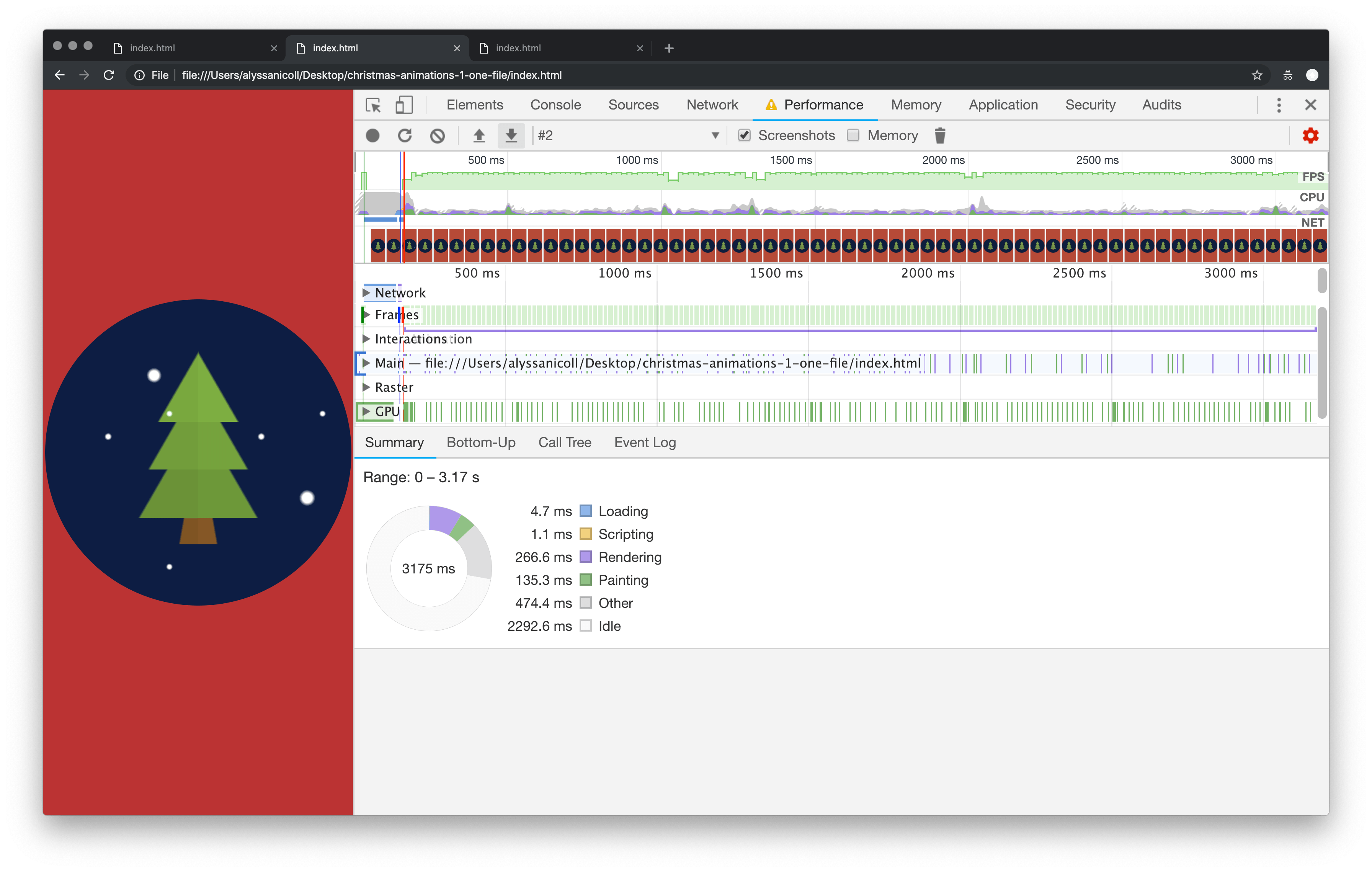
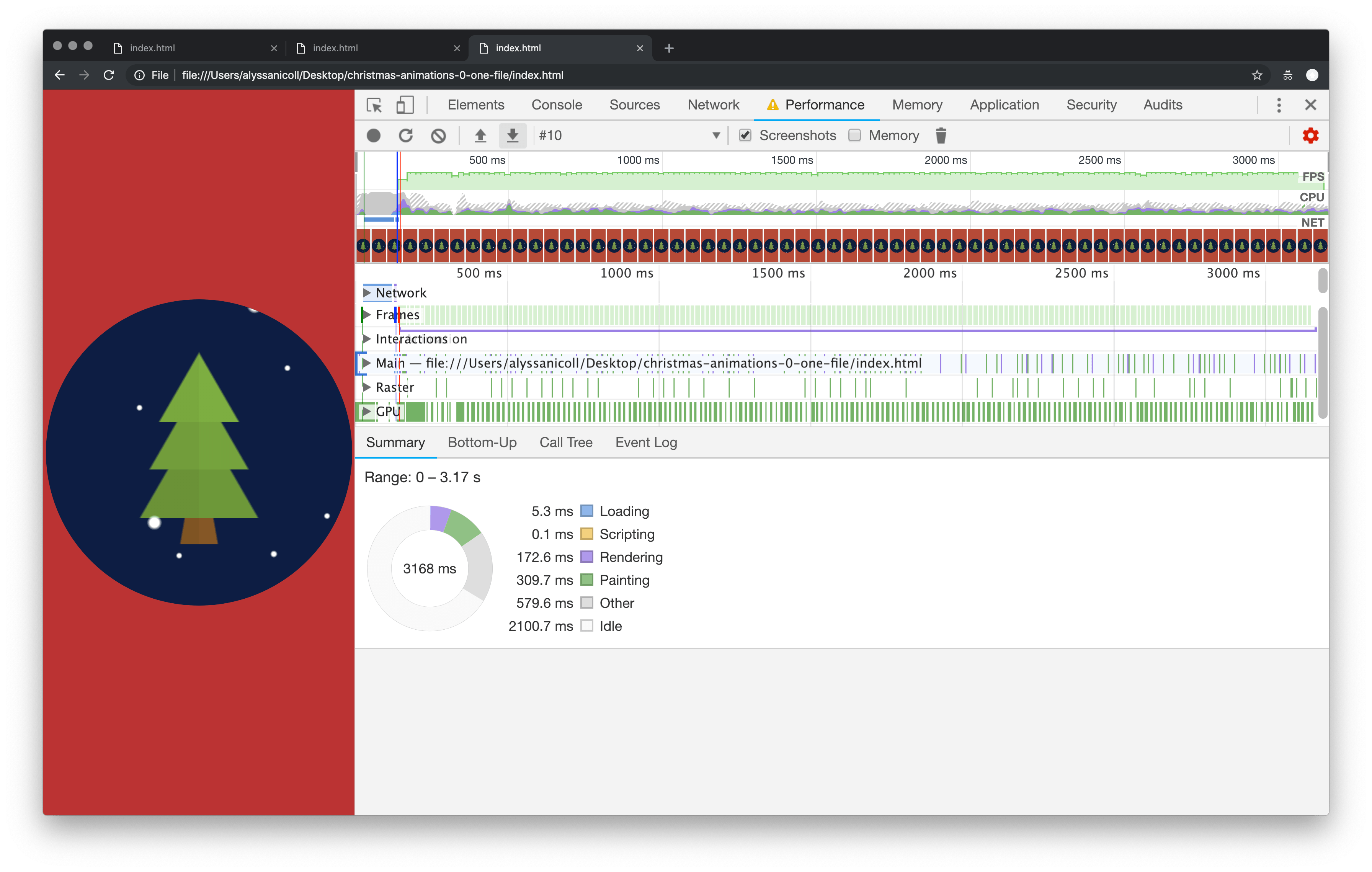
Now as you can tell by the two different screenshots, before and after our animation change, our cleaned up version is an improvement. Not only are our frames per second higher overall, but our CPU usage is MUCH lower overall. This is because we don't need to run a costly background image animation the ENTIRE LIFE of the web page.

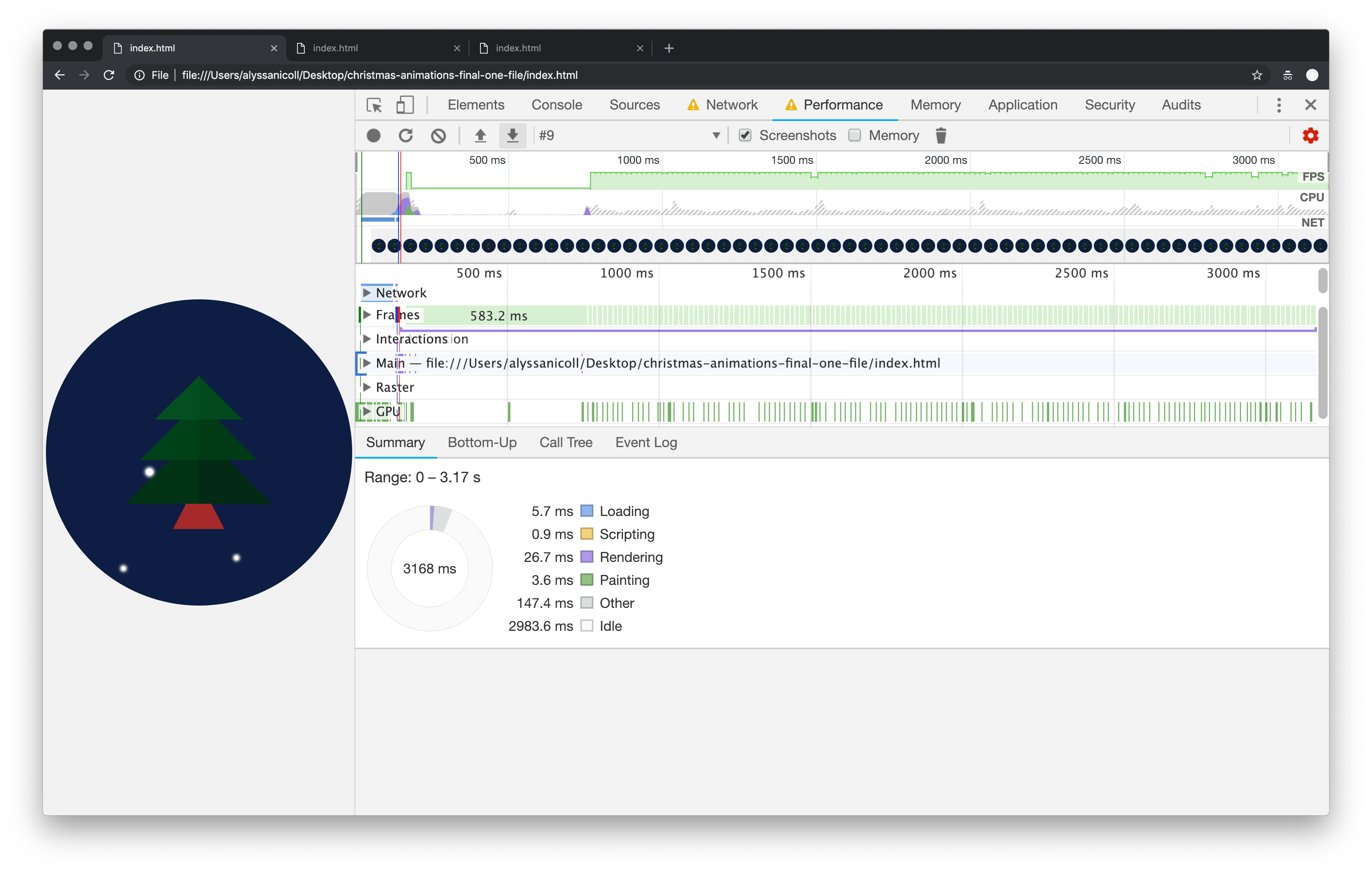
There is still a lot that we could clean up, however. We are still using unsavory things like gradients and background images to draw our tree and snow. Be sure to check out my next post (coming soon) for optimizing your drawings in CSS to see how we achieved these sick benchmarks! WOOHOO, look how low THAT CPU usage is! Hot dog!
I hope you’ve enjoyed this post, just in time for the holiday season! I’ll see you in the next post to optimize your drawings! Until then, happy coding everyone.