How can you create and design a beautiful custom button in Kendo UI? Learn how you can easily build the perfect button for your web apps.
Hello and welcome back to the Angular and Kendo UI Unite Video Series. If you are new to the series, I suggest checking out the first post or watching the video series these posts are based on. This is post number two, and we're going to talk all about buttons.
If you want to watch the video, you can dive in right here:
In the first post we were able to get our Angular app created, and we were able to install Kendo UI and start using our very first component, which was the button. However, we didn't have time to cover everything there is because there's so many, many more options. This article will show the black belt ways of the button, so let’s get started!
Find the code to follow along, here on my Github!
So here we have our app with the buttons we built last time in the button control panel component. We have a k-block (a Kendo block) and inside that we've got our list of buttons with different appearances:
<div class="k-block">
    <button kendoButton [look]="'default'">Default Button</button>
    <button kendoButton [look]="'outline'">Outline Button</button>
    <button kendoButton [look]="'bare'">Bare Button</button>
    <button kendoButton>Button</button>
  </div>
Next I want to show that you can actually add a couple of other things to your Kendo UI Button. Right now we are controlling the appearance with this [look] property binding, but you can actually do multiple things like disable, set a button as a primary button, make a button togglable or give it an icon. So let's get started and I'll show you those things! It’s good to know though that all of them are using property binding, which is with the square brackets. If you need a Angular binding refresher, check out this post I wrote!
Property Binding to Customize Buttons
| Disabled Button | [disabled]="true" |
| Primary Button | [primary]="true" |
| Toggleable Button | [toggleable]="true" |
| Icon Button | [icon]=" 'check' " |
As you would probably anticipate, to disable a button, we will go ahead and set disabled equal to true: [disabled]="true".

Now that final button in the list is disabled. Pretty easy peasy. Let's go ahead and create another button, but this one will be a primary button. I’m giving it the text of Primary Action, but this would really be something like the Submit button on the bottom of a form or a Checkout button on a shopping cart. The primary action button should be the primary goal of the page.
<button kendoButton [primary]="true">Primary Action</button>

Next up, toggleable. We are going to make the next button we create toggle, simply by setting [toggleable]="true".
<button kendoButton [toggleable]="true">Toggleable</button>

WARNING: If you are using Kendo UI Buttons older than 4.1.3, you will need to spell the toggleable attribute togglable.
So the last and final feature we're going to talk about right now is icons. You can actually set icon equal to a string with the icon name. Let's look at calendar. That one is pretty scandalous. :D
<button kendoButton [icon]="'calendar'" [toggleable]="true">Icon Button</button>
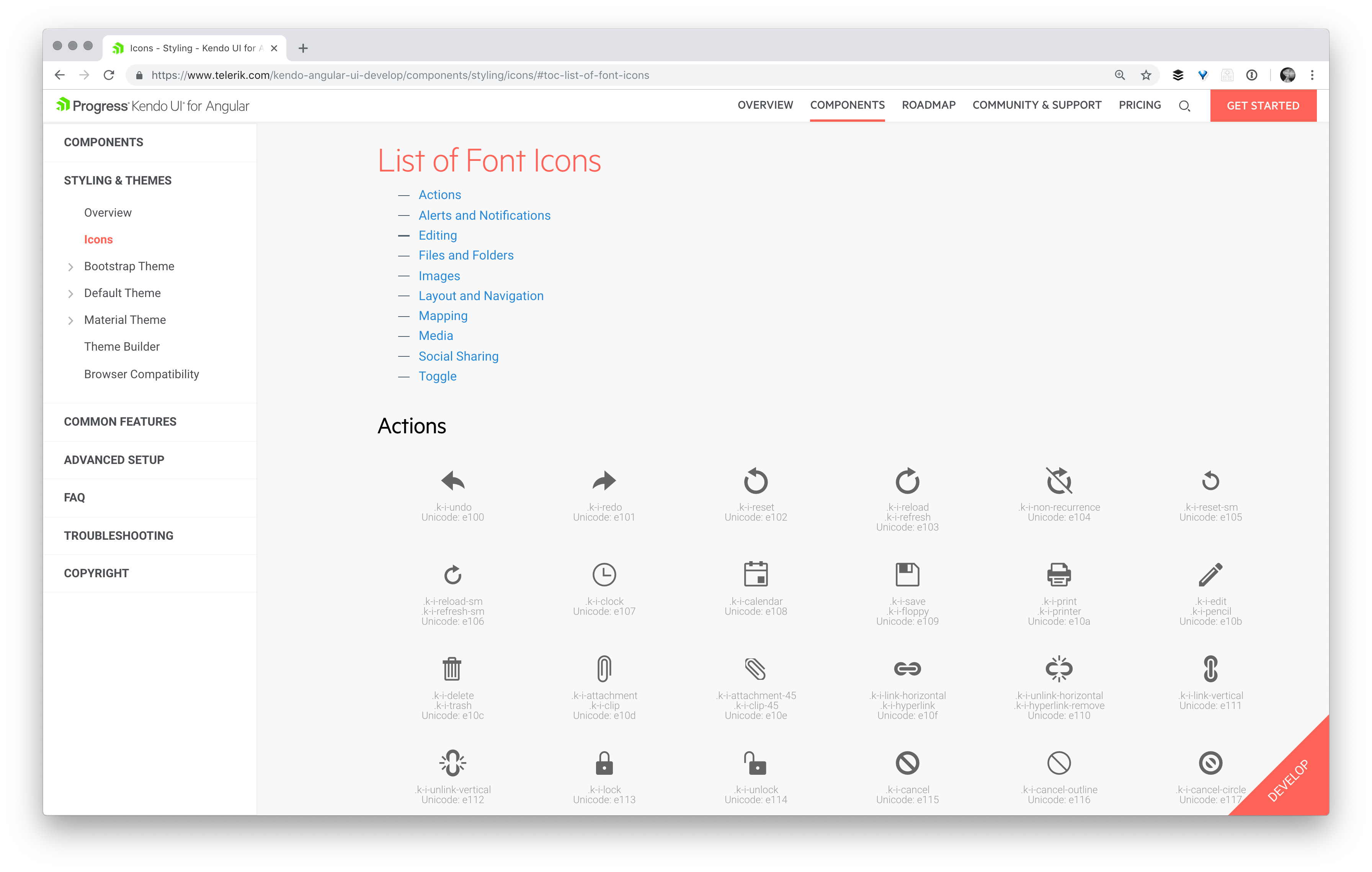
You can see we've got the icon button, super sexy, with the calendar icon. And you might be pondering to yourself, how do I know what other icons I have available to me? Well let’s explore the docs together to find more about icons. From our button icons docs you can navigate here to a full list of the built in icons we provide!

So that is how we know which icons are available to us.
In this next section, I’m going to comment out some of our earlier buttons so we can play around more with our beautiful icon buttons.
Button Group
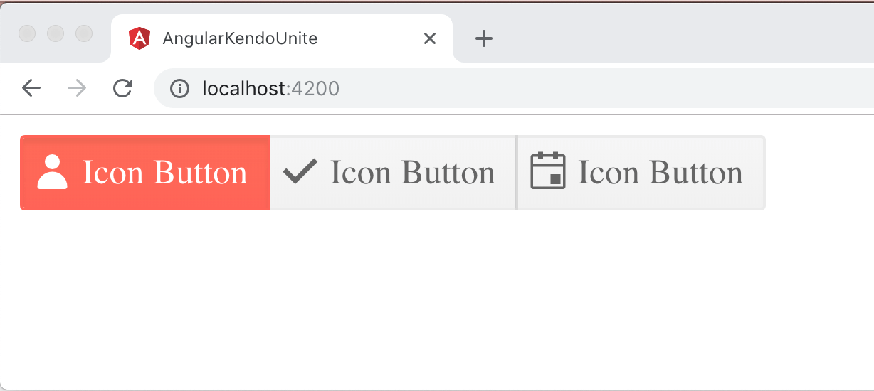
We have something called a Kendo Button Group which you can actually wrap your buttons in. It groups them nicely together, and the outer button edges have a nice rounded corner whereas the middle button is squared off, so it looks like they are one cohesive group, which is super nice. There is a neat combo of being in the kendo-buttongroup element as well as having toggleable set that gives this distinct look:
<kendo-buttongroup>
  <button kendoButton [icon]="'user'" [toggleable]="true">Icon Button</button>
  <button kendoButton [icon]="'check'" [toggleable]="true">Icon Button</button>
  <button kendoButton [icon]="'calendar'" [toggleable]="true">Icon Button</button>
</kendo-buttongroup>
Giving a Button Group Full Width
You can also have this Button Group responsively span the full width, by setting width to 100%.
<kendo-buttongroup [width]="100">
  <button kendoButton [icon]="'user'" [toggleable]="true">Icon Button</button>
  <button kendoButton [icon]="'check'" [toggleable]="true">Icon Button</button>
  <button kendoButton [icon]="'calendar'" [toggleable]="true">Icon Button</button>
</kendo-buttongroup>

Giving Button Group a Disabled or Bare Appearance
There are a couple other features I wanted to talk about. We already talked about how we can change the individual appearance of each button, and you can also do that to all the buttons within a Kendo UI Button Group quite easily as well. So inside the Kendo UI Button Group you can just say "look equals" and then things like default, outlines, etc. Let's go ahead and try outline.
<kendo-buttongroup [width]="100" look="outline">
  <button kendoButton [icon]="'user'" [toggleable]="true">Icon Button</button>
  <button kendoButton [icon]="'check'" [toggleable]="true">Icon Button</button>
  <button kendoButton [icon]="'calendar'" [toggleable]="true">Icon Button</button>
</kendo-buttongroup>

Just as with individual buttons, you can change the disabled property or the appearance to outline, flat, or bare by setting them to true on the button group itself.
The End Product
<button kendoButton [disabled]="true">Disabled Button</button>
<button kendoButton [primary]="true">Primary Action</button>
<button kendoButton [toggleable]="true">Toggleable</button>

<kendo-buttongroup [width]="100" look="outline">
  <button kendoButton [icon]="'user'" [toggleable]="true">Icon Button</button>
  <button kendoButton [icon]="'check'" [toggleable]="true">Icon Button</button>
  <button kendoButton [icon]="'calendar'" [toggleable]="true">Icon Button</button>
</kendo-buttongroup>
I hope you've enjoyed learning more about Kendo UI buttons. There's actually two extra components, the dropdown button and the split button, that we don't have time to dive fully into in this blog series, but our docs talk all about them and we have amazing examples. Please do check those out if you're curious, they're great! I'll see you back here for the next part of Angular and Kendo UI Unite.
If you're new to Kendo UI for Angular, you can learn more here or just jump into a free 30 day trial today.