RadAutoComplete is quite the popular control for various mobile applications and use cases—even more than we initially anticipated. We have been getting a lot of feature requests for the control, so we went on a journey to see how to accommodate all of our customer needs. After carefully reviewing the various feedback we got and considering the current usage of the control, we have decided that it would be best if we came up with a brand new control.
So, without further ado, meet AutoCompleteView. This new component is easier to use, more intuitive and more feature rich. In this blog post, I will introduce you to the AutoCompleteView control for Xamarin.Forms. You will also learn about the new features coming with it and how to use them.
Let's begin with how to start using the control. The snippet below shows how to add the new control to your XAML files in your project.
<telerikInput:RadAutoCompleteViewx:Name="autoCompleteView"
Watermark="Search here..."/>
Features
Some of the main features of the AutoCompleteView are:
- Tokens Support
- Advanced Filtering Capabilities
- Remote Search Functionality
- Watermark Support
- No Result Found Message
- Creating Custom Templates
- Show / Hide Suggestions
The Remote Search and Show / Hide Suggestions were some of the most requested scenarios from our customers and are now available in the new control’s feature set. Let me guide you through those features and how to get started with them. For the rest of the features, just use the links above to get more details.
Remote Search Functionality
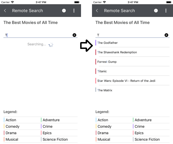
The Remote Search functionality of the RadAutoCompleteView control allows you to easily take the user input, trigger searching algorithm and assign the results to the ItemsSource of the control.
The control now exposes a new event that occurs when the text is changed: TextChanged event. This event receives a TextChangedEventArgs argument containing data related to the event. This is the place where your searching algorithm can be implemented to achieve the Remote Search functionality.
The image below shows the control in Remote Search state:

Show / Hide Suggestions
The ShowSuggestions and HideSuggestions methods are another feature provided in the new AutoCompleteView control. Using those methods, you can easily show / hide all suggestions immediately as the user focuses on the input field. This functionality allows you to use the AutoCompleteView control as a ComboBox control.
The following example demonstrates how to use ShowSuggestions() method.
To show all suggestions, assign a handler to the focused event. For example:
this.autoCompleteView.Focused += this.AutoCompleteView_Focused;... and call the ShowSuggestions() method inside AutoCompleteView_Focused:
privatevoidAutoCompleteView_Focused(objectsender, FocusEventArgs e){ this.autoCompleteView.ShowSuggestions();}For more information about the show / hide suggestions, you can check our Methods article.
Creating Custom Templates
If the default templates of the control do not suit your needs, you can easily define a custom template. The available templates for customization are:
- SuggestionItem Template
- ShowMore Template (for Tokens Support)
- NoResult Template
- Loading Template (for Remote Search Functionality)
Let’s create a simple example using the ShowMore Template and NoResult Template.
For our example, we will create a business object from type City with Name property:
publicclassCity{ publicstringName { get; set; } publicCity(stringname) { this.Name = name; }}In our ViewModel, we can create the collection, which will hold the cities and add cities name:
publicclassViewModel{ publicList<City> Source { get; set; } publicViewModel() { this.Source = newObservableCollection<City>(); this.Source.Add(newCity() { Name = "London"}); this.Source.Add(newCity() { Name = "Madrid"}); this.Source.Add(newCity() { Name = "Paris"}); this.Source.Add(newCity() { Name = "Tokyo"}); this.Source.Add(newCity() { Name = "New York"}); this.Source.Add(newCity() { Name = "Sofia"}); this.Source.Add(newCity() { Name = "Toronto"}); this.Source.Add(newCity() { Name = "Budapest"}); this.Source.Add(newCity() { Name = "Barcelona"}); this.Source.Add(newCity() { Name = "Rome"}); }}You can add as many cities as you want!
As a final step, we can add the AutoCompleteView control and the templates in our XAML file:
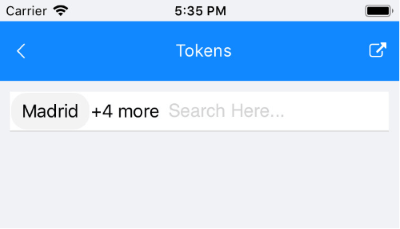
<telerik:RadAutoCompleteViewDisplayMode="Tokens" ItemsSource="{Binding Source}" TextSearchPath="Name" Watermark="Search Here..." BackgroundColor="White"> <telerik:RadAutoCompleteView.BindingContext> <local:TokensViewModel/> </telerik:RadAutoCompleteView.BindingContext> <telerik:RadAutoCompleteView.ShowMoreTemplate> <DataTemplate> <LabelText="{Binding Path=., StringFormat='+{0} more'}" VerticalTextAlignment="Center"/> </DataTemplate> </telerik:RadAutoCompleteView.ShowMoreTemplate> <telerik:RadAutoCompleteView.NoResultsTemplate> <DataTemplate> <LabelText="No match was found for the specific search. Please try again."/> </DataTemplate> </telerik:RadAutoCompleteView.NoResultsTemplate></telerik:RadAutoCompleteView>The image below shows how the ShowMore Template looks:
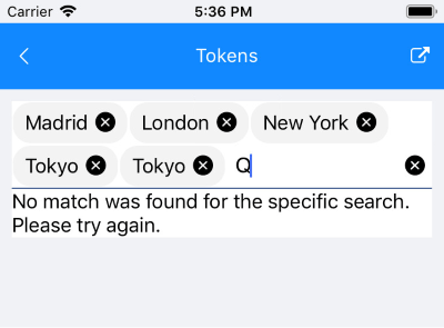
... and the NoResult Template:
In case you want to customize the SuggestionItem Template, check our help article.
Have we caught your interest with the new AutoCompleteView control and its features? You can find various demos of the new control in our SDK Samples Browser and the Telerik UI for Xamarin Demo application.
I hope that this information will get you started with the new control—any feedback on it is highly appreciated, as always. If you have any ideas for features to add to the control’s features set, do not hesitate to share this information with us on our Telerik UI for Xamarin Feedback Portal.
If this is the first time you're hearing about Telerik UI for Xamarin, you can find more information about it on our website or dive right into a free 30-day trial today.
Happy coding with our controls!