The DatePicker, TimePicker, and DateTimePicker each enable your users to enter dates and times in a variety of different use cases. Let's take a look at their differences as well as where they're similar.
In this post, we will continue reviewing more features of the `DatePicker` component for Kendo UI, and introduce the `TimePicker` and the `DateTimePicker`. A `TimePicker` is a text field that lets you select a time from a dropdown list. The `DateTimePicker` is a text field that allows you to select both the date and time from a calendar and dropdown respectively.
Having these three different pickers gives you greater flexibility to handle more use cases in your apps. A date picker could be used to select birthdates or reserve a hotel date. A time picker could be used on an airline’s search form to select flight times. And a date and time picker could be used to schedule meetings or make dinner reservations. Coming up, you will learn how to implement each component.
DatePicker
One advantage to using the `DatePicker` is the ease with which you can navigate dates. By clicking the header of the calendar you can page through the calendar a month at a time. To change the navigation depth, configure the `depth` option. If you choose to set it to year, the picker shows months in the view. If you set it to decade, it shows years. And if you set it to century, it shows decades.
Navigating by month is practical if you are using the picker for something like a hotel reservation. You might navigate by year, decade, or century if the picker is used to search for historical data over a long time span. In cases like that, it helps to set the starting view of the picker using the `start` option. This allows you to jump to a particular month, year, decade or century without having to page through the picker. In the following example, the picker's view starts with the decade. Once a selection is made, you can navigate by year.
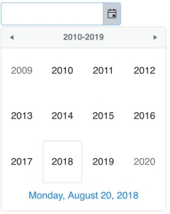
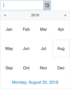
```js<!DOCTYPE html><html> <head> <metacharset="utf-8"> <title>Date and Time Pickers</title> <linkrel="stylesheet"href="https://kendo.cdn.telerik.com/2018.2.620/styles/kendo.bootstrap-v4.min.css"> <scriptsrc="https://code.jquery.com/jquery-1.12.3.min.js"></script> <scriptsrc="https://kendo.cdn.telerik.com/2018.2.620/js/kendo.all.min.js"></script> <style> body {font-family: helvetica;} </style> </head> <body> <inputid="datePicker"> <script> $(document).ready(function(){ $('#datePicker').kendoDatePicker({ start: 'decade', depth: 'year' }); }); </script> </body></html>```In the example of using the picker to make a hotel reservation, there might be dates that are unavailable that you do not want users to be able to choose. If you are making an appointment calendar you may want to black out dates that are holidays. To make certain dates unselectable you use the `disableDates` parameter. This can be equal to an array of dates or a function. This example will disable the dates December 24, 2018 and December 25, 2018.
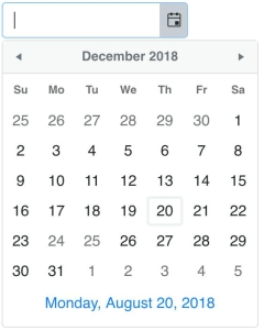
```js$('#datePicker').kendoDatePicker({ disableDates: [new Date(2018, 11, 24), new Date(2018, 11, 25)]});```The disabled dates are shown grayed out. I would like to change the appearance of these dates so they stand out more on the calendar. To change the template of the calendar's cells, you use the `month.content` option. We want the template to show our disabled dates in red. To do this, first, we will create a helper function that will check if a date is one of the disabled dates.
```jsfunction isDisabled(date, dates) { for(var i = 0; i < dates.length; i++) { var d = dates[i]; if (date.getFullYear() == d.getFullYear() && date.getMonth() == d.getMonth() && date.getDate() == d.getDate()) { return true; } } return false;}```Next, we will add our disabled dates to an array and configure the template in the content option.
```jsvar disabled = [new Date(2018, 11, 24), new Date(2018, 11, 25)];$('#datePicker').kendoDatePicker({ disableDates: disabled, month: { content: '# if (isDisabled(data.date, disabled)) { #' + '<divclass="disabled">#: data.value #</div>' + '# } else { #' + '#: data.value #' + '# } #' }});```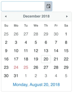
TimePicker
The default `TimePicker` consists of an empty text field with a control that opens a dropdown with a list of times. The list begins at 12:00 AM and ends at 11:30 PM. The values in between are listed in 30-minute intervals. Changing the length of the interval can be done by setting the `interval` parameter of the component. The following example initializes a `TimePicker`:
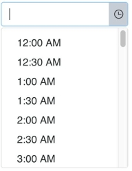
```html<inputid="timePicker"><script> $(document).ready(function(){ $('#timePicker').kendoTimePicker(); });</script>```You can further customize the times by using the `min` and `max` options. These parameters allow you to restrict your list to a range of times. In the case of selecting a time for an appointment, it is practical to have a minimum time and maximum time because appointments are usually made during business hours. Using `min` and `max` coupled with the `interval` allows you to easily generate a list of options. In the case that you would need to define the exact times in the list, you can add an array of times to the `dates` parameter. This is useful when the list of times do not follow a set pattern or when you want to update the available times using the setOptions method
Times must be defined as a JavaScript Date object which uses the following format:
```jsnew Date(year, month, day, hours, minutes, seconds, milliseconds)```The values used for the year, month, and day do not matter because they are ignored when building the component. The seconds and milliseconds do not need to be specified unless you included them in your time format. This example allows you to choose a time from 8 AM to 4:30 PM with one hour intervals:
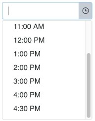
```js$('#timePicker').kendoTimePicker({ min: new Date(2018, 00, 01, 08, 00), max: new Date(2018, 00, 01, 16, 30), interval: 60});```DateTimePicker
The `DateTimePicker` is a combination of a `DatePicker` and a `TimePicker`. You have all of the same options avaiable as the `DatePicker` and `TimePicker` to configure your component. By default, you are given a text field with a control to open a calendar and a control to open a dropdown of times. This is a basic example:

```html<inputid="dateTimePicker"><script> $(document).ready(function(){ $('#dateTimePicker').kendoDateTimePicker(); });</script>```The `min` and `max` options in the `DateTimePicker` is used to set the earliest and latest date that can be selected from the calendar. The `dateInput` option allows users to enter dates and times into the field. The default format is `M/d/yyyy h:mm tt` where `tt` is the AM or PM designation. The format of the date is changed by configuring the `format` option. The format of the dropdown values is changed by configuring the `timeFormat` option.
If the `dateInput` is set to true, then the `min` and `max` value will also determine the earliest and latest time that can be entered into the input. And unlike the `TimePicker`, the `dates` array defines dates in the calendar. These dates can then be used to customize the template for rendering the month view of the calendar. The following example adds a date input to the component and changes the format of the date and the dropdown:

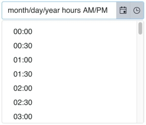
```html<inputid="dateTimePicker"style="width: 50%">``````js$('#dateTimePicker').kendoDateTimePicker({ dateInput: true, format: 'M/d/yy h tt', timeFormat: 'HH:mm',});```Conclusion
The `DatePicker`, `TimePicker` and `DateTimePicker` share many similarities making them easy to use together. For example, a date picker can be coupled with a time picker in a calendar app to filter times based on the selected date. All of the components have the same events and methods and include many of the same parameters. The `DateTimePicker` also has a toggle method to show or hide the date or the time popups. It includes all options from the `DatePicker` as well as the `TimePicker` in addition to a `timeFormat` option to distinguish between formatting the input and formatting the dropdown times.
The last picker we will take a look at is the `ColorPicker`, which is a more powerful version of the HTML5 `<input type="color">` element. Stay tuned.
Try Out Kendo UI for Yourself
Want to start taking advantage of the more than 70+ ready-made jQuery Kendo UI components, like the Grid or Scheduler? You can check out our demos and begin a free trial of Kendo UI today to start developing your apps faster.
Angular, React, and Vue Versions
Looking for UI components to support specific frameworks? Check out Kendo UI for Angular, KendoReact, or Kendo UI for Vue.