A date picker makes it easy and quick for your users to enter a date in a visual calendar input field. Find out the difference between a standard HTML date picker and the Kendo UI DatePicker.
In the last episode, you saw how the NumericTextBox could be used to format different kinds of numeric input. In this episode, you will learn about the DatePicker. In a nutshell, the DatePicker is a component that allows users to select a date from a calendar or enter it into an input field.
The benefit of using a date picker is that entering dates becomes easier for the user and you can control the format of the data you receive. Date pickers can be used in apps to choose the dates for hotel reservations, flight departures, or appointments. Next, we will look at the differences between an HTML date picker and the Kendo UIDatePicker component.
HTML Date Input Type
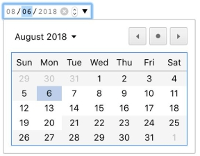
An HTML date picker is created by setting the type attribute of an input element to date. You can restrict the input by setting the value, min, and max attributes on the element. The value attribute represents the selected date. The min attribute is the earliest date that can be selected and the max attribute is the latest date that can be selected. For each attribute, the date should have the format yyyy/mm/dd. The format for entering dates in the input field is mm/dd/yyyy. This is an example of a date picker with a current and minimum value of August 6, 2018, and a maximum value of August 20, 2018:

<input type="date" value="2018-08-06" min="2018-08-06" max="2018-08-20">The <input> has controls to increase or decrease the value of the month, day and year individually as well as a button to open the date picker. Dates outside of the range that can be selected are shown grayed out on the date picker. Sections in the input for the month and year in this example have been disabled so the user cannot enter restricted dates. One of the limitations with the HTML date input is the date picker is not available for all browsers and the format of dates cannot be changed.
Kendo UI DatePicker
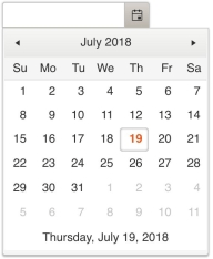
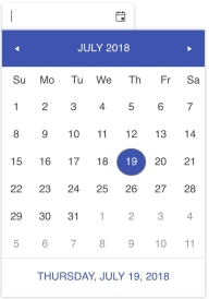
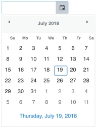
The Kendo UI DatePicker provides much more control over the appearance of dates and the behavior of the component. Unlike an HTML date picker, the Kendo UI DatePicker has a footer that displays the current date. Also, the input field of the component does not restrict the values that can be entered by default. This has to be set explicitly with the dateInput option. The following is a default date picker shown using the default theme, material theme, and bootstrap theme:


<input id="date-picker">
<script>
  $(document).ready(function(){
    $('#date-picker').kendoDatePicker();
  });
</script>
The following code sets the selected value to the current date, the minimum value to the current date, and the maximum value to July 30, 2018. Dates are set using the JavaScript Date object:
$('#date-picker').kendoDatePicker({
  value: new Date(),
  min: new Date(),
  max: new Date(2018, 06, 30)
});
When min or max are set, the dates that are out of range will be empty. However, a template can be specified to change the appearance of any of the dates as well as the footer of the date picker. You can change the format of the dates with the format option or with the culture option. Using the culture option not only changes the format of the date but updates the names of months and days to the language of the culture.
Conclusion
An HTML date picker is primarily an input field that is restricted to entering dates. The field can further restrict dates with a minimum and maximum value. The Kendo UI DatePicker also lets you set the minimum and maximum value of a date in addition to several other options to format the input and customize the appearance of the component.
A feature worth highlighting is the support for different cultures. There are many different ways to enter dates and being able to set the date based on a particular culture makes it convenient to adapt the component for global use. In upcoming episodes, we will dive deeper into the DatePicker by putting it to use in a small app that includes several other components we have reviewed.
Try Out the DatePicker for Yourself
Want to start taking advantage of the Kendo UI DatePicker, or any of the other 70+ ready-made Kendo UI components, like Grid or Scheduler? You can begin a free trial of Kendo UI today and start developing your apps faster.
Angular, React, and Vue Versions
Looking for UI component to support specific frameworks? Check out the DatePicker for Angular, the DatePicker for React, or the DatePicker for Vue.