Check out the changes coming in the R3 2018 release of Kendo UI for Angular, including new notifications, Grid improvements and more.
In an attempt to spare folks from a novel of a blog post highlighting all of the changes across every single product within Kendo UI, I've tried to separate things out to more consumable blog posts. While you might've seen some of this information in the summary blog post, I wanted to dive in to the changes that have happened with the R3 2018 release of our native Angular components!
New Components for Angular
When it comes to new components, the biggest item that many of you have waited on is the Scheduler component, which I'll cover later in a section below this one. In terms of other new components, the R3 2018 release of Angular introduces the new Notification widget, providing a flexible way to display a popup anywhere within your application.
The notification widget is both very simple to use and flexible, which is of course important for any 3rd party UI component! What is nice about this widget is that we not only created a default look-and-feel for notifications across all of our themes, but we've also gone ahead and created styles for common notification types.
Here's a look at the "warning" type with our Default theme:

And here we have the "error" type with the same theme:

Both of these can be achieved by tweaking a single setting, the type configuration option.
We also provide the ability to customize the content of the notification by passing in a string, using an Angular template, or even rendering a custom component!

In the image above we have a template for the notification that renders a custom component that contains a button.
For more information around usages for the notification I recommend looking at the Notification documentation section.
Updates to Existing Angular Components
Of course we also added functionality across the board to other UI widgets within our native Angular UI component suite.
I know you love hearing about the Grid, so for R3 2018 we added the following features.
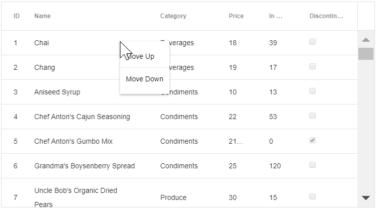
Context Menu

Thanks to integrations with the native Angular Context Menu from Kendo UI, we can now provide a menu which allows us to interact with items found within the Grid. This demo goes into more details.
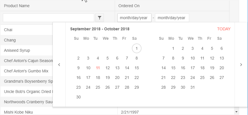
DateRangePicker as a Method of Filtering

Using the DateRange component that we introduced with the last release, we can provide a filter component that allows us to filter between a set of dates within our Grid data. Check out this demo to see how.
Performance Update with Smooth 60 FPS While Scrolling
One HUGE item that I want to mention while talking about the Grid is that we recently took a look at how we could increase performance in certain scenarios. As a result of this research we've implemented a way that allows us to achieve a smooth 60 FPS while scrolling through large data sets. That's some buttery smooth action right there! One of the developers dove in to how we discovered the issue and what we did to improve performance in this great blog post.
State Persistance
We often get asked how to preserve state within our more complex components, and this of course includes the Grid. This can include current selected items, filters applied, or sort order. Of course, this could also be used when paging between various pages within the Grid as well. Whatever your requirements call for, check out our persist state in the Angular Grid demo to see how you can add this to your application today.
Chart Axis Position
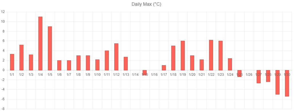
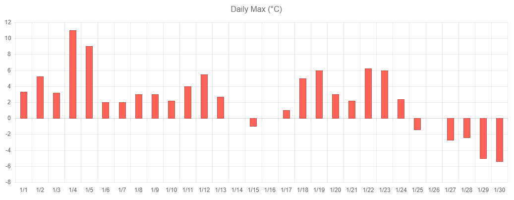
In the Data Visualization world we added support for axis positioning, which lets developers choose exactly where the labels of an axis will be positioned. This is similar to how labels can be positioned in Excel charts, especially in scenarios with a negative Y axis.
The best way to showcase this is in the following before and after pictures.
Before

After

See the different? Much easier to read when dealing with both positive and negative values.
Update on the Scheduler
The Scheduler component has been a huge focus of ours over the last couple of months. Implementing such an extensive component is no easy task, which is why a lot of energy went in to the component for this release. However, at the time of writing this blog post the Scheduler widget is not quite ready yet.
While I apologize for not being able to show you this widget today, as we need a little bit of extra time to get things right, I do have good news! Since we release components in individual packages and the engineering team has adopted Continuous Delivery we can release the Scheduler component the second that it's ready.
With that being said, the Scheduler component will be released sometime over the next couple of weeks, which means that while you will have to wait for a little big longer it won't be too long - the Scheduler's release is right around the corner.
Is Something Missing? Let us Know!
Our releases would not be possible without the feedback that we get from folks using our components, so make sure that your voice is heard! Is something missing from this release like a component or a particular feature? Use the comment section below or submit this to our feedback portal to ensure that we can add your feedback to our roadmap!
Live Kendo UI Webinar!
Want to see more? How about seeing folks work with the new bits live? Well I have good news, we have the LIVE Kendo UI Webinar happening on September 27th at 11 a.m. ET! Join myself and the Kendo UI Developer Advocate team a live webinar where we step through the latest-and-greatest while on air. Reserve your seat today as they are limited!