The way you structure a dashboard makes a critical difference in how effective it will be. Having the right data is important, but to the viewer, it is all about the organization and presentation of the data. In this article, we'll take a look at a few different ways to organize a dashboard to meet the user's requirements.
Dashboard
noun
1. (in an automobile or similar vehicle) a panel beneath the front window having various gauges and accessories for the use of the driver; instrument panel.
2. Computers.
a. a user interface or web page that gives a current summary, usually in graphic, easy-to-read form, of key information relating to progress and performance, especially of a business or website:
b. a web page or portal that provides links to key information and useful tools on a website:
3. a board or panel at the front of an open carriage or the like to protect the occupants from mud or dirt cast up by the hoofs of the animals drawing the vehicle.
https://www.dictionary.com/browse/dashboard
When we hear the word “dashboard”, we all have a pretty good idea of what it means, or at least we think we do. It’s the place we go to see how well things are going. In a car, it tells us how fast we are going, some key factors about the engine, the temperature outside and more. For most of us in the web world, this means a web page that might be implemented in basic HTML and CSS. Or it could be a web app created using a framework like React, Angular or Vue, plus sophisticated UI components like Kendo UI. Or it could be something implemented using a tool like Tableau.
No matter what type of technology you are using, the real critical decision is how you are going to display your data. The technology you use is just an implementation detail, although it might matter a good deal to the person or team that has to implement it. But to the user, it is all about the organization of the data. Does it tell a story, or just drop a lot of random data on the user? Does it guide to user to a conclusion, or require the user to figure out what it all means by themselves? Or does it force a narrative on the user that perhaps they are not looking for?
There is no right or wrong answer to how you create a dashboard, it is only right or wrong when viewed against the objectives of the user. But whatever the user’s requirements are, the dashboard should conform to that requirement and present the data in a way that helps meet the goals. With that in mind, let’s take a look at a few different ways to organize a dashboard to meet those requirements.
Key Factors in Visual Narrative
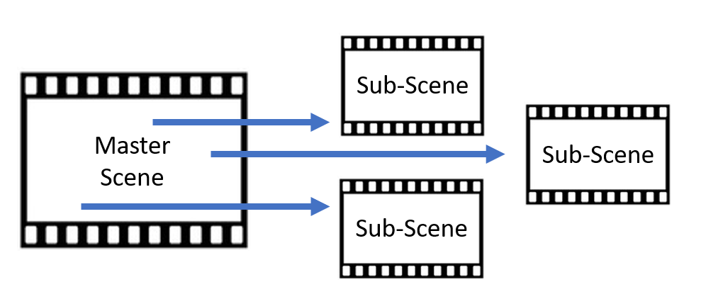
Creating a dashboard means creating a story. You want to say something to your audience, to convey some information beyond just splashing a lot of data on the screen. One place we can take some inspiration from is film. A complex dashboard shows more than one set of information, although all of the information should be related somehow, in the same way that a movie is composed of multiple scenes that might all be different, but all add to the basic story. So instead of individual screens, or data visualizations, let’s think of each one as a “scene” that tells us part of the story.
When we are concerned with creating multiple scenes and connecting them somehow, there are three main elements we want to consider:
- Structure
- Highlight
- Transition
The structure of each scene is important to present the data in a useful and intelligent way. Within each scene, we will want to consider what and how to highlight specific data. We might use colors, we might use shapes—something to help the key data (lead actors) stand out from the rest of the data in the scene (the supporting cast). Finally, we want to consider how to transition from one scene to another in a way that helps with our narrative story. In a simplistic example, if we have a “yes” button in green in one scene, we don’t want to have a green button in the same location in another scene that is now a “no." Carrying themes and styles through from one scene to another helps keep the viewer properly oriented.
The Narrative Spectrum
Having taken a quick look at how to create effective scenes, let’s see how we connect all of these individual scenes into our dashboard. This is where we begin to expand beyond our simple movie analogy and add in an element of interactivity. We can see three basic formats of a flow from scene-to-scene. These are:
- Author-driven
- Reader-driven
- Hybrid
Author-driven is our basic movie style. The viewer is presented with a set of scenes in a specific sequence and while they may be able to control the execution, or “playback”, scene 1 is always followed by scene 2, which is always followed by scene 3, and so on. This is useful when there is a specific narrative that we want to present to the viewer, and it is important to view the scenes in a specific order to display a series of cause-and-effect scenes.
Reader-driven let’s the viewer select the order of scenes to be viewed. This can be useful when there is not specific order implied to the individual scenes, and they are relatively independent to each other but with some common connection.
There will be times when we might want to do a little of both—show a sequence of scenes to tell a specific narrative, and combine that with an ability to direct the flow of the rest of the scenes. We might want to show a sequence of scenes first (a “mini movie”) and then let the user select where to go next, or we might let the user select where to go first but then show a fixed sequence of scenes for each selection. There are a variety of ways you can combine these two approaches.
Types of Dashboards
Now let’s take a look at the three specific types of dashboards that match these three forms of narrative. These are:
- The Slideshow
- The Drill Down
- The Martini Glass
The Slideshow is our author-driven format and is basically a movie where we want to tell a specific narrative sequence. For example, in once scene we might want to show the number of environmental laws impacting waste discharge into the Cuyahoga river in Ohio. We could show the amount of pollution in the Cuyahoga River over time in another scene. We could show some detail in this scene, listing types and amount of pollution. In a third scene, we could chart out the dates, severity, duration and damage of fires on the river. Yes, I said “on” the river—it had been so polluted with flammable, oily waste that on several occasions, the river actually caught fire. The last time was in 1969 and it sparked (no pun intended) a range of environmental protection laws and environmental protection agencies. The river is still polluted, but not nearly as much, and it hasn’t caught on fire since then.

The Drill Down is our view-driven narrative format and is most useful when the “story” might vary. For example, we might want to track our investments and see how they are all doing but with the option of diving into each type for more information. We might have an initial scene that shows the results of our farm investments, our gold investments, and our art investments. We could view the results for each area and select one of these three areas to dive into for more detail. These would be very different scenes because the data displayed on each individual scene would be a completely different organization.

On the farm investments scene, we might want to learn more about the weather, international tariffs on agriculture, farm labor, etc. On the art investments scene, we might be interested to find out more about disposable income in the wealthy, recent art sales, museum endowments which cause art acquisitions, etc. The Gold scene might focus on jewelry sales, mining operations, etc. These are three very different sets of data and would be shown in very different scenes, but which scene to view and in what order (or if they are even viewed at all) would be up to the viewer.
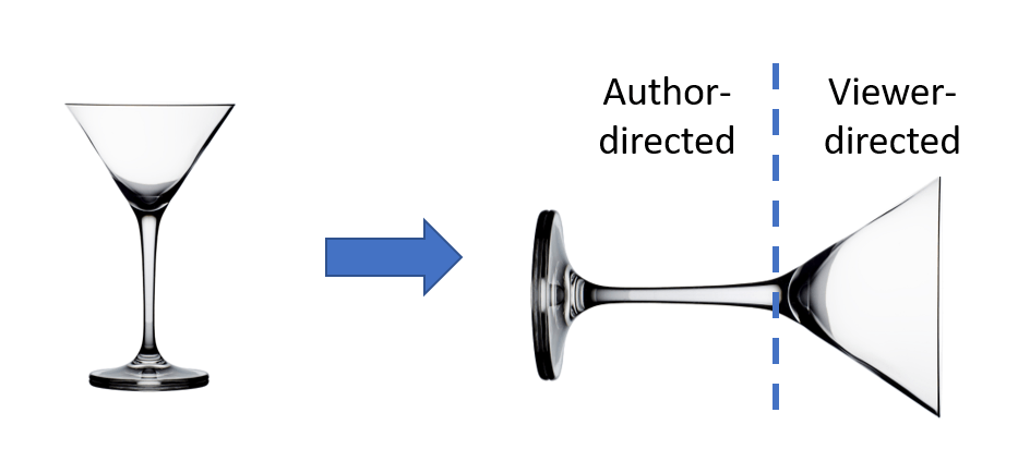
My favorite format is the Martini Glass (largely because of the name) which is our hybrid form and is basically a slideshow followed by a drill-down. Why is it called a martini glass? Take a martini glass, and turn it on its side. You have a narrow stem on the left (the author-driven part) followed by the wide triangle of the glass (the user-driven part). This gives us a chance to tell a story and set-up the situation but then let the viewer explore on their own. How long the “stem” (author-directed) is, and how wide the bowl is (viewer-directed) will depend on the story and the data that you are trying to convey. And, of course, you need to decide on whether to use Gin or Vodka in the martini.

If we go back to our fiery river example from the slideshow, we could expand that to become a martini style dashboard by adding in a back-end with more information. We could still tell our story of regulation and pollution and fires as a sequence (the stem of the glass) but then provide a drill-down section on river fires that let’s the viewer explore property damage, fire-fighting techniques for river fires (I’m guessing you can’t just pour water on it…), injuries, etc. as a result of the fires.
Summary
Slideshow, Drill Down, and Martini Glass: three basic organizational formats to drive your narrative. Of course, you can mix and match and customize or create more complicated shapes, but this gives you a good starting point and a set of criteria to determine what format will best suite your individual requirements.
The next step after deciding on the structure of your dashboard is to determine what types of individual data display elements you want to use—charts, tables, gauges, etc. You can read more about choosing the right chart in the blog “Deliver a Better User Experience by Using the Right Charts”. For more information on individual data display components, take a look at the ones provided by a professional library of data display components like Kendo UI.