Take a look into the picker controls in Conversational UI as a part of Telerik UI for Xamarin, and explore rendering modes with various APIs.
ChatBots are all the rage these days and for good reason. A well-trained chatbot with deep contextual knowledge can seamlessly automate lots of workflows with human-computer interactions. And enterprises are beginning to discover the cost benefits of chatbot automations - Bot frameworks and AI are destined to rule the next generation of apps.
For developers though, the key would be engaging user experiences through chatbots. And this is where Conversational UI comes in - with polished modern UI for powering chatbot experiences on web, desktop or mobile. One of the most common interactions in chat conversations is asking the user to make a selection from a list of things - you want this to be a rich experience, but seamless for the user.
We recently looked at how this works with date and time pickers. This article unpacks the ItemPicker and CardPicker controls in Conversational UI from the perspective of a Xamarin.Forms mobile app and explores ways of rendering such a picker UI to make for smooth user experiences.
Pickers
While we've already covered the basics of Conversational UI, text based messages in a chatbot conversation are easy to handle - the real value in Conversational UI is in complex custom UI. This is achieved through the RadChatPicker control, which is responsible for presenting the user with a selection of choices as a part of the chat conversation. If you had to choose pizza toppings, would you type them down in text, or simply check off a list? You get the idea. In a chat conversation, it is almost always quicker to elicit user responses when presented with a collection of items to choose from.
Depending on the information that is to be presented to the user and the choice that should be made, the RadChatPicker allows developers to render one of the following types:
DatePicker: for displaying a Calendar to choose a dateTimePicker: for displaying a clock view to choose a timeItemPicker: for presenting a list of suggestions the end user could choose fromCardPicker: for presenting a list of cards with structured layout
The RadChatPicker showcases the value we can offer developers with Conversational UI - the polished sophistication through custom complex chat UI. We covered Date & Time pickers earlier - the bigger need is often to offer selections from a custom list. Telerik and Kendo UI can now offer Item and Card picker controls for various platforms, to be used as a part of chatbot conversational UI.
ItemPicker
Need to have the chatbot user pick one or more options from a list?The RadChatPicker control provides an ItemPickerContext that can be used to display a list of options for the user to choose from. As expected, ItemPickerContext exposes the following properties you can use to provide a list of possible options to the user:
ItemsSource: defines the data source to be bound to as optionsSelectionMode: controls single or multiple selections from ItemSourceSelectedItems: defines the currently selected itemsSelectedItem: defines the last selected item
To try out the ItemPicker, let's first set up a chat - this can be done entirely in the shared PCL or .NET Standard library in a regular XAML page, like so:
<ContentPage.Content>
  <telerikConversationalUI:RadChat x:Name="chat"
                                   BackgroundColor="#FFF6F8FB"
                                   ItemsSource="{Binding Items}"
                                   Margin="5,30,5,30" />
</ContentPage.Content>
In the code-behind, we can set up the bot author and start a chat conversation. And when it comes to demonstrating selecting options from a list, there is simply no better example than picking your favorite pizza toppings - so let's do that.
public MainPage()
{
  InitializeComponent();

  this.botAuthor = new Author ();
  this.botAuthor.Name = "MyBot";
  this.botAuthor.Avatar = "BotFace.jpeg";

  chat.Items.Add(new TextMessage { Author = this.botAuthor, Text = "Welcome to our chat!" });

  this.SelectedPizzaToppings();
}
Now that we have a function to handle pizza topping selection dialogue, we can enhance the ItemPickerContext with some desired properties and add the PickerItem into the chat conversation's Item collection. Notice how we're setting the ItemSource property - this could be a generic collection of any type of object to be used for data binding.
void SelectedPizzaToppings()
{
  ItemPickerContext itemContext = new ItemPickerContext
  {
    ItemsSource = new List<string>() { "Pepperoni", "Sausage", "Chicken", "Mushrooms", "Pineapples", "Onions", "Peppers" }
  };
  itemContext.SelectionMode = SelectionMode.Multiple;
  PickerItem pickerItem = new PickerItem { Context = itemContext, HeaderText = "Please select your pizza toppings: " };

  chat.Items.Add(pickerItem);
  string AllSelectedItems = string.Empty;

  itemContext.PropertyChanged += (s, e) =>
  {
    if (e.PropertyName == "SelectedItem")
    {
      if (itemContext.SelectedItem != null)
      {
        AllSelectedItems = itemContext.SelectedItem + " ";
      }
    }
  };
}
Let's fire up our app - and sure enough, we see a nice polished ItemPicker control allowing for the selection of pizza toppings from a list.
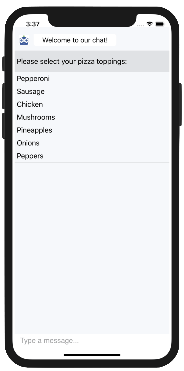
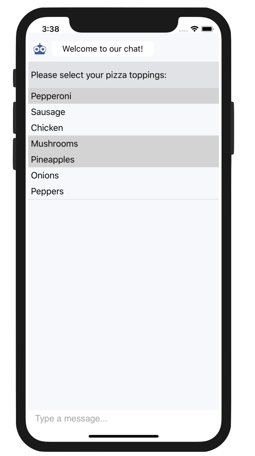
In the code above, we're also listening in on the PropertyChanged event of the ItemPickerContext - in particular, when the SelectedItem property value changes. This is triggered once the user makes selections - our event handler grabs the SelectedItem property value and aggregates all selected toppings. SelectionMode set on the ItemPickerContext can allow the user to choose one or more items from the list - it would be pretty brutal if it was single topping pizza only, right?
CardPicker
When your chatbot presents a list of options for the user to choose from, you would ideally like it to be a seamless user experience. It may be rich data, but it should be easy to glance at and choose from. This is where the Telerik CardPickers in Conversational UI can light up your chatbot scenarios.
The RadChatPicker control provides CardPickerContext that can be used to display a list of customizable cards. Each card can present complex information in a user-friendly structured manner and allows the user to interact with it. As expected, CardPickerContext exposes the following properties you could use to adjust the rendering of cards:
Cards: implementsIEnumerable<CardContext>that holds the available CardsBasicCardContext: placeholder for displaying a card withTitle,SubTitleandDescriptionImageCardContext: derives fromBasicCardContextwith an additionalImagepropertyActions: implementsIEnumerable<CardActionContext>that holds the card actions through commands
BasicCardContext
Let's try rendering cards in our app - for developers to choose which upcoming software conference to attend. After a similar chatbot setup, we new up CardPickerContext and add it to our chat's Item collection, as below:
private void SelectConferences()
{
  PickerItem pickerItem = new PickerItem();
  var context = new CardPickerContext { Cards = this.GetConferenceCards(pickerItem) };
  pickerItem.Context = context;
  chat.Items.Add(new TextMessage { Text = "Select a conference:" });
  chat.Items.Add(pickerItem);
}
Notice how we're delegating construction of the IEnumerable<CardContext> to a seperate function - this is just to keep things clean so we know exactly what each card can hold. Let's return BasicCardContext with appropriate property values, like so:
private IEnumerable<CardContext> GetConferenceCards(ChatItem chatItem)
{
  List<CardContext> cards = new List<CardContext>()
  {
    new BasicCardContext() {
        Title ="VS Live",
        Subtitle ="Redmond, WA",
        Description ="Yesterday's Knowledge; Tomorrow's Code!",
        Actions = GetCardActions(chatItem, "VSLive")},
    new BasicCardContext() {
        Title ="DevReach",
        Subtitle ="Sofia, BG",
        Description ="Central/Eastern Europe's Premier Developer Conference",
        Actions = GetCardActions(chatItem, "DevReach")},
    new BasicCardContext() {
        Title ="MS Ignite",
        Subtitle ="Orlando, FL",
        Description ="The Ultimate MSFT Tech Conference",
        Actions = GetCardActions(chatItem, "Ignite")}
  };
  return cards;
}
Notice the Actions property? This helps control what happens when a user selects a card - you can carry context through Text and bind it through Command properties. Let's return a collection of simple actions for each of our developer conferences and capture the user card selection, like so:
ICollection<CardActionContext> GetCardActions(ChatItem chatItem, string Title)
{
  var selectAction = new CardActionContext
  {
    Text = "Select",
    Command = new Command(() =>
    {
      var index = chat.Items.IndexOf(chatItem);
      chat.Items.RemoveAt(index);
      chat.Items.Add(new TextMessage { Author = this.chat.Author, Text = "You selected " + Title });
    }),
  };
  return new List<CardActionContext>() { selectAction };
}
We're now ready to fire up our app and see the conference cards in action. Voila! Users can swipe around and see full details of each rendered card:
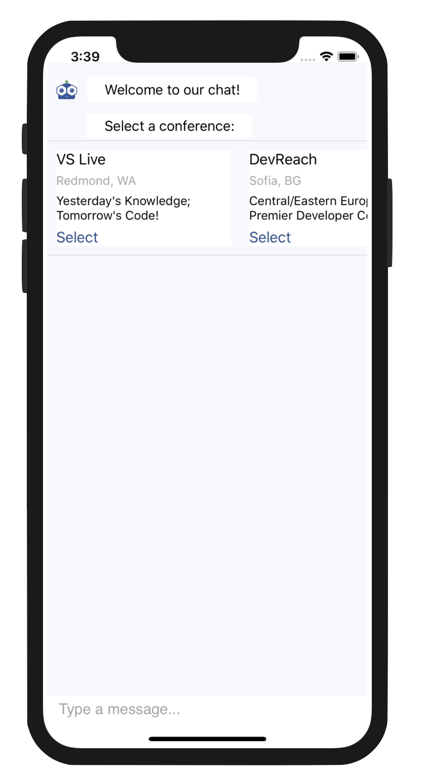
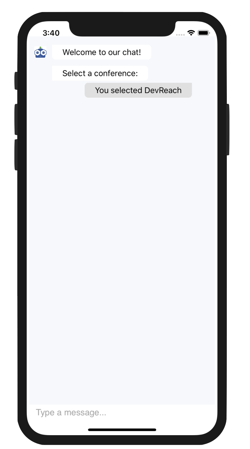
Once the user chooses a card, we can expect the card Actions to bubble up the context and we can stick the selection into our chat's Item collection, like so:
ImageCardContext
ImageCardContext enhances the functionality of the BasicCardContext by providing an additional Image property, so you can add an image to the card definition. This simple addition allows you to present a rich user experience. As it turns out, we humans like our visuals.
To use the ImageCardContext, we can have the same chatbot setup, but instead return an IEnumerable<CardContext> which has the Image property set for each card, like below:
IEnumerable<CardContext> GetConferenceCardsWithImages(ChatItem chatItem)
{
  List<CardContext> cards = new List<CardContext>()
  {
    new ImageCardContext() {
        Title ="VS Live",
        Subtitle ="Redmond, WA",
        Description ="Yesterday's Knowledge; Tomorrow's Code!",
        Image = "VSLive Logo.png",
        Actions = GetCardActions(chatItem, "VSLive")},
    new ImageCardContext() {
        Title ="DevReach",
        Subtitle ="Sofia, BG",
        Description ="Central/Eastern Europe's Premier Developer Conference",
        Image = "DevReach Logo.jpeg",
        Actions = GetCardActions(chatItem, "DevReach")},
    new ImageCardContext() {
        Title ="MS Ignite",
        Subtitle ="Orlando, FL",
        Description ="The Ultimate MSFT Tech Conference",
        Image = "MSFTIgnite Logo.jpg",
        Actions = GetCardActions(chatItem, "Ignite")}
  };
  return cards;
}
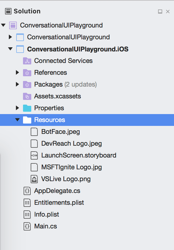
One caveat to note: image resources for a Xamarin.Forms app need to come from platfom-specific projects, as in the case of our iOS project here:
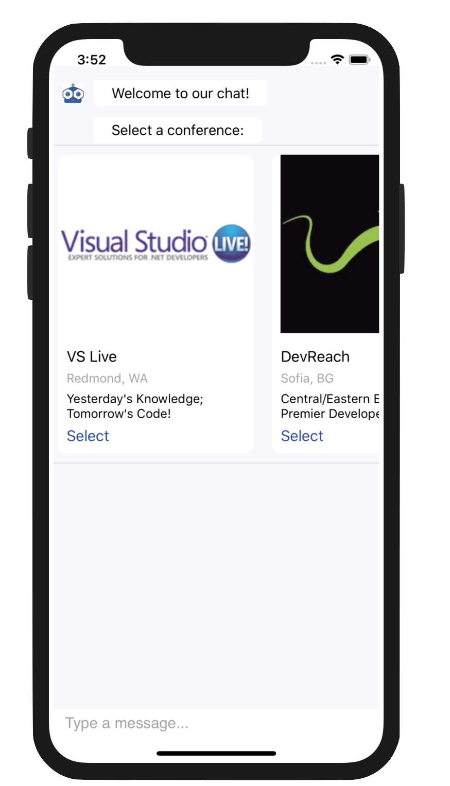
Let's run our app. Sure enough, image cards make it much more enticing to pick our developer conference of choice. All other card behavior remains unchanged. It's just a better user experience.
That's a Wrap
Modern chatbots demand rich user experiences and Conversational UI is here to help developers render polished UI for enabling engaging efficient conversations. One the most common tasks in chatbot conversations is asking the user to make a selection from a list - from a user's perspective, you want this to be as simple as: 'Click, Click & Done.'
The ItemPicker and CardPicker controls in Conversational UI are here to make this easier. Developers get various rendering options, from simple lists to full-blown custom cards. Flexible APIs and MVVM support make it easy for developers to handle user selections, all the while providing a fluid user experience. Time to go light up your chatbot conversations and build amazing experiences.