Learn how to use a MultiSelect component to let users choose tags for a blog post or toppings on a pizza, and the differences between using HTML and Kendo UI to do so.
Last time in this series we reviewed the DropDownList component. The dropdown allowed us to select a single item from a list of items. The next component we will review is the MultiSelect - as the name implies, this component lets you select multiple items from a list of items.
You may use a MultiSelect for letting users choose tags for a blog post or choosing toppings on a pizza. It is possible to create a dropdown list with multiple selections using plain HTML. But with Kendo UI you get more control over the behavior and appearance of the element. In this episode, you will learn about the differences between the HTML multiple select dropdown and the Kendo UI MultiSelect component.
HTML Multiple Select
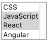
Creating a MultiSelect component with HTML is the same as creating a select menu with the addition of the multiple attribute. This changes the select menu from a dropdown list to an element with all items visible for you to choose from. You can also restrict how many items are visible with the size attribute. To make multiple selections, on Windows you hold the 'ctrl' key while clicking on the options. On Mac, you hold the 'command' key. This is what our element looks like before it has been initialized as a Kendo UI component:

```html<!DOCTYPE html><html> <head> <meta charset="utf-8"> <title>Untitled</title> <link rel="stylesheet"href="https://kendo.cdn.telerik.com/2018.2.620/styles/kendo.common.min.css"> <link rel="stylesheet"href="https://kendo.cdn.telerik.com/2018.2.620/styles/kendo.default.min.css"> <script src="https://code.jquery.com/jquery-1.12.3.min.js"></script> <script src="https://kendo.cdn.telerik.com/2018.2.620/js/kendo.all.min.js"></script> </head> <body> <select id="multiselect"multiple> <option value="0">CSS</option> <option value="1">JavaScript</option> <option value="2">React</option> <option value="3">Angular</option> </select> </body></html>```Kendo UI MultiSelect Component
To turn the element into a Kendo UI component, we just need to add the following code after the markup:
```html<script> $(document).ready(function(){ $('#multiselect').kendoMultiSelect(); });</script>```
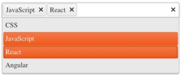
The difference now is there is a text field to enter items and the options are only shown when you have focused on the text field. The selected items are visible as a tag in the text field as well as in the dropdown. Also, you don't have to hold any special keys to select or remove options. You just click on the item. To remove a selection, you can click on the 'x' button in the tag or click on the item from the dropdown.
Additional Features of the MultiSelect
It is not necessary to list all of our options in the markup. We can configure them in the component’s API. This is the refactored code with the options removed from the select element and defined in the dataSource field:
```html<select id="multiselect"multiple></select><script> $(document).ready(function(){ $('#multiselect').kendoMultiSelect({ dataTextField: 'text', dataValueField: 'value', dataSource: [ {text: 'CSS', value: 0}, {text: 'JavaScript', value: 1}, {text: 'React', value: 2}, {text: 'Angular', value: 3} ] }); });</script>```Another feature of the MultiSelect is filtering. Your options can be filtered based on the value that is entered into the text field. You can search for options that start with the value, end with the value or contain the value. By default, when you type into the text field you will see options that start with the value. This is an example of how to implement filtering so that you get suggestions that contain the specified value:
```js$('#multiselect').kendoMultiSelect({ filter: 'contains' });```Summary
The MultiSelect component is like a dropdown list that lets you choose multiple items from a group of related items. The design of the MultiSelect is a vast improvement over the default HTML version. Because the options are hidden, you don't risk overwhelming the user with too much information. Plus, it takes up less physical space on your page. This is especially useful when you have a long list of options. In which case, you don't have to define the options inside of the API. The information can be pulled from a URL or another file that contains JSON. This is possible to configure with the MultiSelect component.
In the next episode, you will learn about the ComboBox. The ComboBox is also like a dropdown list but you can manually enter options that have not been defined already.
Try Out the MultiSelect for Yourself
Want to start taking advantage of the Kendo UI jQuery MultiSelect, or any of the other 70+ ready-made Kendo UI components, like Grid or Scheduler? You can begin a free trial of Kendo UI today and start developing your apps faster.
Angular, React, and Vue Versions
Looking for UI components to support specific frameworks? Check out the MultiSelect for Angular, the MultiSelect for React, or the MultiSelect for Vue.