Learn how to use the editing features of the Kendo UI grid component including incell, inline, and popup editing modes.
In my previous article on the Grid, you learned how to create a Grid in Kendo UI from an existing table and how to build one from a data source. We will continue where we left off and explore other features of the Grid component. Specifically, we will review how to edit data.
The ability to manipulate the data in a grid is a major way this component differs from table components found in other themes. If you have users that need to manage your data, using a Grid provides a user-friendly interface to your database. Instead of querying the database directly, changes can be made with a point and a click. It’s possible to build entire web apps based on this functionality alone. If you have ever used a hosted database service, chances are they provided a data grid for you to manage your data. In this article, you will see how to customize the different editing modes and methods of the Grid component.
Editing Incell
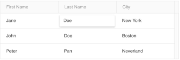
There are three editing modes you can configure to edit data in the Grid. The default mode is incell. This allows users to enable editing by tapping on a table cell. This is the least restrictive means to update your data. You might use this option when the field doesn’t contain critical information like a comment field. To enable this mode you set the editable option to true or incell. This is a grid in incell editing mode:

<!DOCTYPE html>
<html>
<head>
  <title>Grid</title>
  <link rel="stylesheet" href="https://kendo.cdn.telerik.com/2018.2.620/styles/kendo.common-material.min.css">
  <link rel="stylesheet" href="https://kendo.cdn.telerik.com/2018.2.620/styles/kendo.material.min.css">
  <script src="https://code.jquery.com/jquery-1.12.3.min.js"></script>
  <script src="https://kendo.cdn.telerik.com/2018.2.620/js/kendo.all.min.js"></script>
  <style>
    body { font-family: Helvetica; }
  </style>
</head>
<body>
  <div id="grid"></div>
  <script>
    $(document).ready(function() {
      $('#grid').kendoGrid({
        editable: 'incell',
        columns: [
          { field: 'first', title: 'First Name' },
          { field: 'last',  title: 'Last Name' },
          { field: 'city',  title: 'City' }
        ],
        dataSource: {
        data: [
          { id: '0', first: 'Jane',  last: 'Doe', city: 'New York' },
          { id: '1', first: 'John',  last: 'Doe', city: 'Boston' },
          { id: '2', first: 'Peter', last: 'Pan', city: 'Neverland' }
        ]
        }
      });
    });
  </script>
</body>
</html>
Using the edit() event listener you can capture when changes are made to the table cell. You can use this to access the data model or the container element of the cell.
$('#grid').kendoGrid({
  edit: function(e) {
    console.log(e.model);
  }
});
Editing Inline
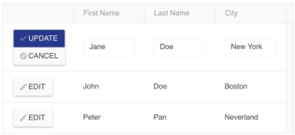
If you do not want to make it this easy for users to change the data, you can use inline mode. In this mode, users have to click a button to enable editing and to confirm the changes. You also can choose to cancel the changes and none of the edits will be saved. This ensures that the changes made are intentional and not by accident. If you are going to use the inline mode, you have to also set the command option in the parameters. The command option is a column like your other columns. Except instead of binding to your data fields, it holds the commands to manipulate your table.

$('#grid').kendoGrid({
  editable: 'inline',
  columns: [
    { command: 'edit' },
    { field: 'first', title: 'First Name' },
    { field: 'last',  title: 'Last Name' },
    { field: 'city',  title: 'City' }
  ]
});
Notice that there is now an update and cancel button in place of the edit button. The event data will also return the entire table row. To handle the event when you click update, use the save() event listener. This can be used when you want to display a confirmation message to the user.
When creating a Grid that is editable, it is important to define the schema to prevent any errors when changes are made. At a minimum, you will need to define the id field in the schema’s model. Here is an example of the configuration for the schema:
dataSource: {
  data: [
    // removed for brevity
  ],
  schema: {
    model: {
      id: 'id',
      fields: {
        id: { type: 'number' },
        first: { validation: { required: true } },
        last:  { validation: { required: true } },
        city:  { validation: { required: true } }
      }
    }
  }
}
Other parameters you can add to fields include a default value, if it is editable, or nullable.
Editing in Popup
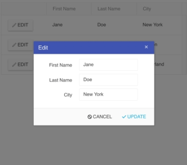
The last mode, popup, also requires the user to click on an edit button except the changes are made in a modal window. Using a popup focuses the user’s attention strictly on the form and prevents them from doing anything else on the page. A popup may also be easier for your users to update data because you have better use of the space. When there are many fields, the information is better organized as a form. This is the table in popup mode:

$('#grid').kendoGrid({
  editable: 'popup'
});
If you want to do something to your grid other than creating, updating, reading, or destroying data, you can create a custom command. Options for configuring a command include setting the text, icon class and template. This example adds a copy icon to the command column that when clicked prints the data item it belongs to:
columns: [{
  command:[{
    name: 'copy',
    template: '<a class="k-grid-copy k-icon k-i-copy"></a>',
    click: function(e) {
      e.preventDefault();
      var tr = $(e.target).closest("tr");
      var data = this.dataItem(tr);
      console.log(data);
    }
  }]
}]
For the click handler to work, a class with the name k-grid-[command] has to be included in the template where [command] is replaced with the value of the commands’ name field.
Final Thoughts
In the examples shown, we used a local data source to build our grid. However, that is not much of an improvement over creating a grid from an HTML table. To really get the most out of this component, you should try binding the grid to a remote data service. You can perform CRUD operations on your data just by adding a URL to the dataSourcetransport object. Not only does this save you from having to write your own custom request handlers, it makes it possible to build large-scale applications. Web apps like customer relationship management and inventory management software, email clients and media playlists can all be created using the Grid component. In the next post, you will learn how.
Try out the Grid for Yourself
Want to start taking advantage of the Kendo UI jQuery Grid, or any of the other 70+ ready-made Kendo UI components, like the Charts or Scheduler? You can begin a free trial of Kendo UI today and start developing your apps faster.
Angular, React, and Vue Versions
Looking for UI components to support specific frameworks? Check out the Grid in Kendo UI for Angular, the Grid in Kendo UI for React, or the Grid in Kendo UI for Vue.