Learn how to create resizable and collapsible sections in your Web App's UI using the Kendo UI Splitter Component.
On the last episode, you learned how to wield the window component. This next component will further elevate your Kendo UI skills so you can conquer more complex applications. The splitter is a component that divides a view into resizable and collapsible sections. You may have seen splitters used in your browser window or a code editor. When you inspect the page of a browser, a pane appears that shows the HTML and CSS of the page. A code editor like CodePen uses splitters to divide the view with panes for the code files and a pane to preview the content. In this episode, you will learn how to use a splitter to recreate a layout like CodePen’s editor.
Creating a Basic Kendo UI Splitter
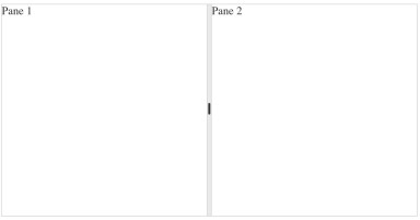
A splitter is created by adding a container HTML element to your page with child elements that represent each pane. You initialize the splitter with `$(element).kendoSplitter()`. By default, the panes will be displayed horizontally with each pane positioned side by side. The width of the panes will be divided equally to fit the width of the container. Dividers will let you resize the width of the panes, but it will not let you collapse them. Collapsing a pane can be triggered by double-clicking on the divider. This is an example of a splitter with two panes for you to get started with in the dojo.

```html<!DOCTYPE html><html> <head> <link rel="stylesheet"href="https://kendo.cdn.telerik.com/2018.1.221/styles/kendo.common.min.css"/> <link rel="stylesheet"href="https://kendo.cdn.telerik.com/2018.1.221/styles/kendo.default.min.css"/> <script src="https://kendo.cdn.telerik.com/2018.1.221/js/jquery.min.js"></script> <script src="https://kendo.cdn.telerik.com/2018.1.221/js/kendo.all.min.js"></script> </head> <body> <div id="splitter"> <div>Pane 1</div> <div>Pane 2</div> </div> <script> $(document).ready(function(){ $('#splitter').kendoSplitter(); }); </script> </body></html>```Next, you will see how to make a splitter that has a more complex layout. To do so, we will create splitters within a splitter.
Creating the Code Editor
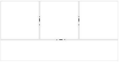
The component we will be making will mimic an online code editor. There will be a top pane where code can be entered, and a bottom pane where the preview of the code will show. The top pane will be split into three panes--one for our HTML, CSS, and JavaScript. This is what it will look like:

First, we will create a splitter that has two vertical panes sitting on top of each other. We will make both panes collapsible. And set the height of the bottom pane to be 35% the total height of the splitter. Here is the new markup:
```html<!DOCTYPE html><html> <head> <link rel="stylesheet"href="https://kendo.cdn.telerik.com/2018.1.221/styles/kendo.common.min.css"/> <link rel="stylesheet"href="https://kendo.cdn.telerik.com/2018.1.221/styles/kendo.default.min.css"/> <script src="https://kendo.cdn.telerik.com/2018.1.221/js/jquery.min.js"></script> <script src="https://kendo.cdn.telerik.com/2018.1.221/js/kendo.all.min.js"></script> </head> <body> <div id="splitter"> <div>Pane 1</div> <div>Pane 2</div> </div> <script> $(document).ready(function(){ $('#splitter').kendoSplitter(); }); </script> </body></html>```In the initialization code, you will need to set the orientation and configure the properties for each pane.
```js$('#splitter').kendoSplitter({ orientation: 'vertical', panes: [ {collapsible: true}, {collapsible: true, size: '35%'} ]});```
Each object in the `panes` array is listed in the order the panes appear in the markup. The code will only recognize the direct descendants of the element for panes. So although our top pane has child elements, they won’t show as split panes. To do this, we need to initialize the top pane element as a Kendo UI splitter component. Each pane will also be collapsible, and because they will be displayed horizontally there is no need to specify the orientation. This is the updated code for the second splitter:
```js$('#top-pane').kendoSplitter({ panes: [ {collapsible: true}, {collapsible: true}, {collapsible: true} ]});```
If you wanted to make a splitter out of the bottom pane you can add elements inside of it’s HTML and call `$('#bottom-pane').kendoSplitter()`. There a number of ways you can create the layout you want.
Conclusion
The splitter component gives you the flexibility to create many different layouts. However, it is not meant to be used to position or control the flow of content on your page. That is the responsibility of a grid system. The purpose of the splitter is to create multiple windows within one window. The objective is to communicate that each window, or pane, has independent content. This becomes more evident considering the splitter component can load content into panes using a URL. The URL might be a web page or an API endpoint that returns data. Because there are so many creative ways you can use a splitter, our training won't be stopping here. In the next lesson, we will be testing your abilities to use multiple components together in an app. But that shouldn’t be a problem for you because a Kendo UI warrior is always ready for battle.
Try out the Splitter for Yourself
Want to start taking advantage of the Kendo UI Splitter, or any of the other 70+ ready-made Kendo UI components, like Grid or Scheduler? You can begin a free trial of Kendo UI today and start developing your apps faster.
Angular, React, and Vue Versions
Looking for UI component to support specific frameworks? Check out the Splitter for Angular or the Splitter for Vue.