We continue our training on layout components by learning how to use the Window component, which brings attention to content without interrupting normal app operation.
In the last lesson, you warmed up to layout components using tooltips. This lesson, we will raise the level of our training by learning how to use the window component.
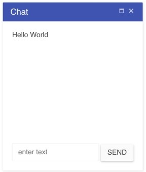
A Kendo UI window is a modal window with a title bar. Modals are elements positioned over the content in a document. Windows are used when you want to bring attention to some content without interrupting or obstructing the normal operation of the app. For example, a browser window lets you visit web pages on your computer while also letting you interact with other apps on your operating system. A chat window on a web page lets you send messages while still letting you interact with the page's content. Below, I will show you how to use the Kendo UI window component to create a chat window.
Creating a Basic Kendo UI Window
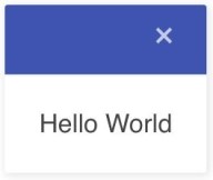
The minimum needed to create a window is a container element. You initialize the element with kendoWindow(). The default window will have a title bar with a close button and a section for content. The content will be whatever you place inside the HTML container element. Alternatively, it can be specified through the content option which will load data from a URL. The window will also be resizable and draggable. Here is an example to practice in the dojo:

<!DOCTYPE html>
<html>
  <head>
    <title>Kendo UI Example</title>
    <link rel="stylesheet" type="text/css" href="https://kendo.cdn.telerik.com/2018.1.221/styles/kendo.common-material.min.css">
    <link rel="stylesheet" type="text/css" href="https://kendo.cdn.telerik.com/2018.1.221/styles/kendo.material.min.css">
    <script src="https://kendo.cdn.telerik.com/2018.1.221/js/jquery.min.js"></script>
    <script src="https://kendo.cdn.telerik.com/2018.1.221/js/kendo.all.min.js"></script>
    <style>
      body { font-family: 'helvetica'; }
    </style>
  </head>
  <body>
    <div id="window">Hello World</div>
    <script>
      $(document).ready(function() {
        $('#window').kendoWindow();
      });
    </script>
  </body>
</html>
Loading Dynamic Content in a Window
Right now, this is pretty plain. When implementing a window, you'll want to fill it out with more content. Specifically, you might include a title that states the purpose of the window and buttons to give the user a choice of actions. The title bar can also be configured with additional actions to manipulate the window. Besides a close action, there is a minimize action which hides the content of the window, a maximize action that expands the window to fit the full screen and a refresh action that refreshes the content of the window when a URL has been specified.
This example is a window that fetches data from the Github API and displays the name of the user.
$('#window').kendoWindow({
  content: {
    url: 'https://api.github.com/users/albertaw',
    template: '#= data.name #',
    dataType: 'json',
    iframe: false
  },
  actions: ['refresh']
});
Creating a Chat Window
A chat window is a good use case for employing the content option. Messages can be fetched from an API and a template can be used to format the display. For our example, we will only create the shell of a chat window. But as an exercise, you can experiment with loading data into the window. We will position our window in the lower right-hand corner of the page. To do so, I will create a parent element and use fixed positioning to place it where I want on the page. Then I will tell the component to append itself to the parent element with the appendTo option. I will also remove the ability to resize and move the window. Here is the updated code:

#parent {
  position: fixed;
  bottom: 0;
  right: 1em;
  width: 20em;
  height: 25em;
}

#content {
  height: 16em;
}
<div id="window">
<div id="content">Hello World</div>
<form>
<input class="k-textbox" type="text" placeholder="enter text">
<button class="k-button">Send</button>
</form>
</div>
<div id="parent"></div>$(document).ready(function() {
$('#window').kendoWindow({
title: "Chat",
actions: ['maximize', 'close'],
width: "100%",
appendTo: "#parent",
draggable: false,
resizable: false
});
});Conclusion
At first glance, the window component appears just like a dialog, but functionally they are different. Both are modal windows that appear on top of app content. However, you use a dialog when you want to interrupt the app's normal operation. Dialogs achieve this by disabling interaction with background content. They also cannot be moved. You might use a dialog for an alert window or a confirmation window.
The window component can be made immovable, unresizable, and given an overlay so that it has the behavior and appearance of a dialog. These options are useful when you want to use the window component to create other custom components. The key to remember is that a dialog blocks app content and a window does not. Next time, we will step up our training even further with the splitter component.
Try Out the Window for Yourself!
Want to start taking advantage of the Kendo UI Window, or any of the other 70+ ready-made Kendo UI components, like Grid or Scheduler? You can begin a free trial of Kendo UI today and start developing your apps faster.
Angular, React, and Vue Versions
Looking for UI component to support specific frameworks? Check out the Window For Angular, Window for React , or Window for Vue .