Toolbars are important UI elements for containing a list of commands. Learn how you can easily create a toolbar that will enhance your users' experience.
Hopefully, you feel comfortable now using the <button> and button groups. Next we will take a look at the ToolBar. The ToolBar is a container for a list of commands. You may have seen them used in photo editors, or document viewers. In an editor, a ToolBar can include commands to change the font, adjust the line spacing, and insert images.
What differentiates a ToolBar in Kendo UI from other components like a Menu is that it already has a number of elements built-in that you would expect to find in a ToolBar. Specifically, you can add buttons, button groups, split buttons, and custom elements to your ToolBar. In this lesson, we will walk through the creation of a ToolBar using each of these features.
Toolbar Button
A ToolBar is constructed by adding elements to the items array inside the kendoToolBar method. Each element in the array is an object made of key-value pairs describing how to build the component. Specifying the type determines how the component will look and behave. A button type is a stand-alone item in the ToolBar. It can consist of text, an icon, or both. This is a menu button that uses the default Kendo UI theme.

The following is the boilerplate code to create this button. You can test it out in the dojo.
<!DOCTYPE html>
<html>
  <head>
    <title></title>
    <link rel="stylesheet" href="https://kendo.cdn.telerik.com/2018.1.221/styles/kendo.common.min.css" />
    <link rel="stylesheet" href="https://kendo.cdn.telerik.com/2018.1.221/styles/kendo.default.min.css" />
    <script src="https://kendo.cdn.telerik.com/2018.1.221/js/jquery.min.js"></script>
    <script src="https://kendo.cdn.telerik.com/2018.1.221/js/kendo.all.min.js"></script>
    <style>
      body { font-family: 'helvetica'; }
    </style>
  </head>
  <body>
    <div id="toolbar"></div>
    <script>
      $(document).ready(function(){
        $('#toolbar').kendoToolBar({
          items: [
            { type: 'button', icon: 'menu'},
          ]
        });
      });
    </script>
  </body>
</html>
Toolbar Button Group
A button group connects items together that are related. It's a way to visually break up the content in the ToolBar. But more importantly, it helps when you want to communicate to the user that they can only select one or multiple options from a group. In a text editor, you may want to give the user the option to align their text left, right or center. They can only make one selection so it makes sense to present the options as a button group. To create a button group, set the type of the item to buttonGroup and add the configurations for each button to a buttons array. Here is our menu with a button group added to it:

<div id="toolbar"></div>
<script>
  $(document).ready(function(){
    $('#toolbar').kendoToolBar({
      items: [
        { type: 'button', icon: 'menu'},
        { type: 'buttonGroup', buttons: [
          { icon: 'undo' },
          { icon: 'redo' },
          { icon: 'reset' }
        ]},
      ]
    });
  });
</script>
Toolbar Split Button
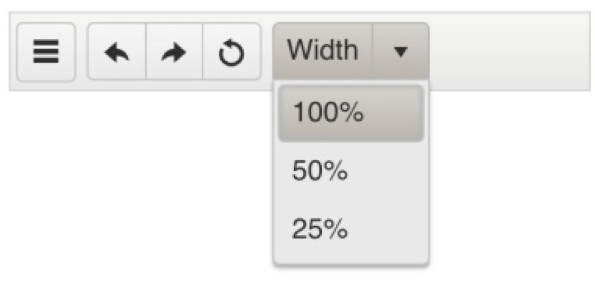
A split button is a dropdown menu that has been styled as a two-part button. The first part of the button is the text or icon. The second part is a clickable arrow that opens the menu. You may have seen a split button in an editor used to select the font size or as a menu for file commands like saving, downloading, and creating new documents. To create a split button, set the type to splitButton and add each menu item to the menuButtons array. This is the split button I've added to our toolbar:

<div id="toolbar"></div>
<script>
  $(document).ready(function(){
    $('#toolbar').kendoToolBar({
      items: [
        {
          type: 'button',
          icon: 'menu'
        },
        {
          type: 'buttonGroup',
          buttons: [
            { icon: 'undo' },
            { icon: 'redo' },
            { icon: 'reset' }
          ]
        },
        {
          type: 'splitButton',
          text: 'Width',
          menuButtons: [
            { text: '100%' },
            { text: '50%' },
            { text: '25%' }
          ]
        }
      ]
    });
  });
</script>
Template
When you want to add an item to the ToolBar that is not one of the predefined types, you use a template. For example, input elements are not a specified type so they would be a candidate for a template. To create a template, instead of using the type field, add a template field to the object that is a string of an HTML element. You can add attributes to the template as you normally would or you can list them in the attributes field of the object. The attributes field is an object with each key being an attribute, and the value is the value of the attribute. Any of the items in the ToolBar can have its attributes set.

{ template: '<input class="k-textbox" type="text" />'},

{ type: 'button', text: 'Find', attributes: { id: 'btn-find', class: 'k-primary' }}
In this example, I gave the button an ID and class. However, items already have an ID field that can be set. This includes individual items in a button group and menu items in a split button.
Conclusion
Each item in a ToolBar is a button and is meant to execute some action. One ToolBar item not mentioned is the separator. A separator has no behavior. It is a visual element that adds a vertical line between items. This is useful when you want to group commands together that don't belong in a button group. Another feature of the Kendo UI ToolBar is that you can customize the appearance of overflow content. By default, when the screen width is smaller than the ToolBar, the overflow items will be replaced with a "more" icon. You can specify if ToolBar items should or should not overflow, and what their appearance is in the overflow state.
Stay tuned - next time, we will look at the treeview component.
Want to Try Kendo UI?
Want to start taking advantage of the Kendo UI toolbar, or any of the other 70+ ready-made Kendo UI components, like Grid or Scheduler? You can begin a free trial of Kendo UI today and start developing your apps faster.
Start My Kendo UI Trial