Almost every mobile app has scenarios that gather user input. It was with this in mind that we introduced the Entry control to Telerik UI for Xamarin, to help you create beautiful and user-friendly forms.
Introducing the New Entry in Telerik UI for Xamarin
The Telerik UI for Xamarin Entry is an input control which accepts strings as an input and gives you the option to customize its look, so it’s consistent with the rest of your app. It extends the default Xamarin Forms Entry control and adds the following features on top of it:
- Support for the Telerik theming mechanism
- Customizable watermark
- Customizing the border around it
- Supports all the features of the Xamarin.Forms Entry such as password input and defining virtual keyboard considering the expected input
In sections below, I'll give you some quick examples of how you can utilize the key features of the control.
Customizing the Watermark
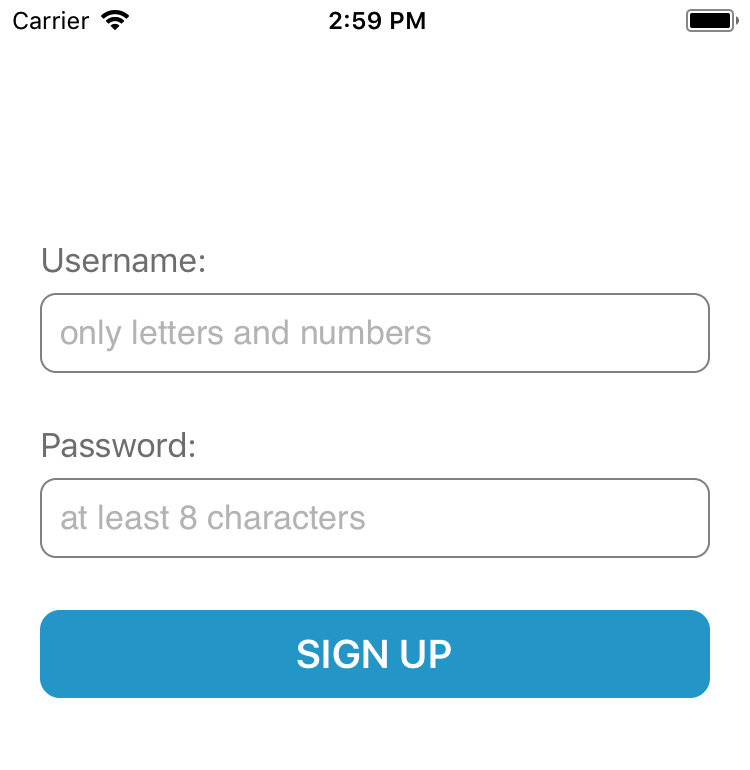
A watermark is used to give guidance to the end user on the text that should be entered. You can easily change the color of the watermark through the WatermarkTextColor property. Check out the snippet below:
<telerikInput:RadEntryBackgroundColor="White" WatermarkText="only letters and numbers" TextColor="Black" WatermarkTextColor="#C0C0C0"> <telerikInput:RadEntry.Padding> <OnPlatformx:TypeArguments="Thickness"> <OnPlatform="Android,UWP"Value="10,10,0,10"/> <OnPlatform="iOS"Value="10,10,0,20"/> </OnPlatform> </telerikInput:RadEntry.Padding> <telerikInput:RadEntry.BorderStyle> <telerikInput:BorderStyleCornerRadius="8" BorderColor="#808080" BorderThickness="1"/> </telerikInput:RadEntry.BorderStyle></telerikInput:RadEntry>
And this is how it looks on an iOS simulator:
Customizing the Look & Feel of the Control
The Entry control allows you to customize its visual appearance, so that it fits the design of your app. Here is an example of how you can utilize the Entry styling features such as BorderStyle, Padding, and others to make your form prettier, and better able to capture end users’ attention:
<telerikInput:RadEntryBackgroundColor="#26A6D1" WatermarkText="Enter First Name" TextColor="White"> <telerikInput:RadEntry.HeightRequest> <OnPlatformx:TypeArguments="x:Double"> <OnPlatform="Android, iOS"Value="40"/> <OnPlatform="UWP"Value="-1"/> </OnPlatform> </telerikInput:RadEntry.HeightRequest> <telerikInput:RadEntry.Padding> <OnPlatformx:TypeArguments="Thickness"> <OnPlatform="Android,UWP"Value="10,10,0,10"/> <OnPlatform="iOS"Value="10,10,0,20"/> </OnPlatform> </telerikInput:RadEntry.Padding> <telerikInput:RadEntry.BorderStyle> <telerikInput:BorderStyleCornerRadius="0" BorderColor="White" BorderThickness="1"> </telerikInput:BorderStyle> </telerikInput:RadEntry.BorderStyle> </telerikInput:RadEntry>And here is the result on an iOS simulator:

Try It Out and Share Your Feedback
I hope that the Entry control will be of help to your in your mobile application projects. If that's so, make sure to download the latest version of Telerik UI for Xamarin, and try it out alongside all the other new features that came with the Telerik R1 2018 Release.
Download Telerik UI for Xamarin
Additionally, we are excited to hear what you think about it and help us improve, so feel free to share your feedback through our Forums or through the Feedback Portal.
Last, but definitely not least, here are some extra Telerik UI for Xamarin resources that you can find useful in building your mobile projects: online documentation, SDK demos, QSF Application and its source code.
Thank you and happy coding!