Learn how to easily theme your WPF applications with the Fluent Theme in Telerik UI for WPF. Add transparency, acrylic effects, shadows, animations and more to modernize your app with the latest UX and UI trends.
As promised by Dobrin back in January, the Fluent Inspired Theme is now available as part of the latest release of Telerik UI for WPF (and WinForms too). In the next few paragraphs I will go over what's in-the-box and focus on how you can add the theme to your WPF application, and how to further customize it based on your needs.
Using Fluent Design in WPF
I remember watching the keynote at Build in 2017, and how the crowd reacted when the guys at Microsoft dropped the news about Fluent. As a C# dev working on WPF, I thought to myself: "Wouldn't it be cool to get on WPF too?" Well, now you can!
I am happy to say that you can now easily revamp your application built with Telerik UI for WPF (yes, you do need to be using our controls for this to work :) ), applying the Fluent Design System principles. Along with the theme, you will get out-of-the-box transparency, shadow, animations on mouse interactions, and last but not least the much-wanted acrylic effect of the Window and even more. I will dig deeper into these customization options further down.
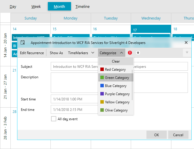
Light and Dark Predefined Palettes
Let's just say we couldn't stop there and made it so that you can choose between two color variations—light and dark—just as you can with our themes that have more than one preset. With one line of code. you can change the default appearance of the Progress Fluent theme from light to dark. This makes support of light and dark variation in your application extremely easy:
FluentPalette.LoadPreset(FluentPalette.ColorVariation.Dark);

You can go even further and customize the default palette colors according to the Windows accent colors:


Sweet, right?
What's Different—In Detail
As I promised, let's dive into the details of what makes this theme different so different:
- FluentControl inside the control templates
It has two built-in effects:
Ripple: ![button_light button_light]()
Glow: ![repeatbutton repeatbutton]()
In the dark variation they look even better:Ripple: ![button_dark_ripple button_dark_ripple]()
Glow: ![repeatbutton_dark_glow repeatbutton_dark_glow]()
- Glyph: A new FrameworkElement which our Fluent theme benefits from. We use it to visualize font glyphs. It boosts the load time, provides out-of-the-box design-time support, respects the FlowDirection and inherits the Foreground of its parent.
- Acrylic effect: Use the ThemeEffectsHelper.IsAcrylic attached property to apply the specific translucent effect to a Window, Popup and window-derivate controls. It is supported currently only on Windows 10. In any other operating system it will simply result in a transparent window/popup. :( But, you can also disable it by setting ThemeEffectsHelper.IsAcrylicEnabled in the static constructor of the MainWindow.
- The MaterialAssist static class comes from the Material theme and it exposes properties such as MouseOverBrush, PressedBrush,CheckedBrush and others which can be used to directly modify the appearance of a control without the need to modify its control template.
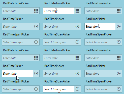
- Transparency: This is kind of a hidden feature. Sharing some cool stuff here! :) Following the concept behind Windows 10, we made the inputs with a semi transparent background (PrimaryBrush) and foreground (InputOpacity) by default and solid on MouseOver and Focused.
![inputs_opacity inputs_opacity]()
If you do not want them to blend with the application background, you can easily change this by setting:
FluentPalette.Palette.InputOpacity= 1d;
FluentPalette.Palette.PrimaryColor= Colors.White;
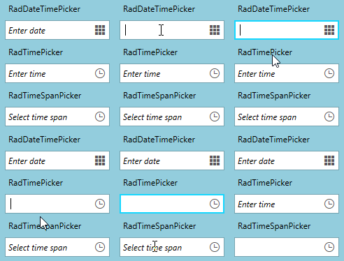
and the result will be:
![inputs_opacity_2 inputs_opacity_2]()
- Support of custom CornerRadius: If your application requires a rounded design, you can set CornerRadius to most of the controls by setting just one line:
FluentPalette.Palette.CornerRadius = new CornerRadius(3);
- Support of custom FocusThickness: If you would like to change the default 2px border which is shown on Focus, you can modify its thickness by setting:
FluentPalette.Palette.FocusThickness= new Thickness(1);
And now, we move onto my favorite part:
How to Add the Fluent Theme to Your WPF Application
You've gotten this far, meaning you are intrigued? :) I hope that's the case, because you will also see how easy it is to set it up and get you going.
If you are using implicit styles:
1. Open your application
2. Click on a Telerik Control in Design View (as I said, you do need the suite)
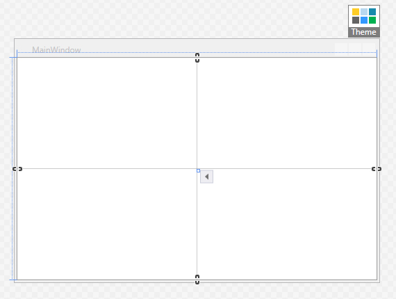
3. Next, Click on the Theme element and choose Fluent from the available themes:
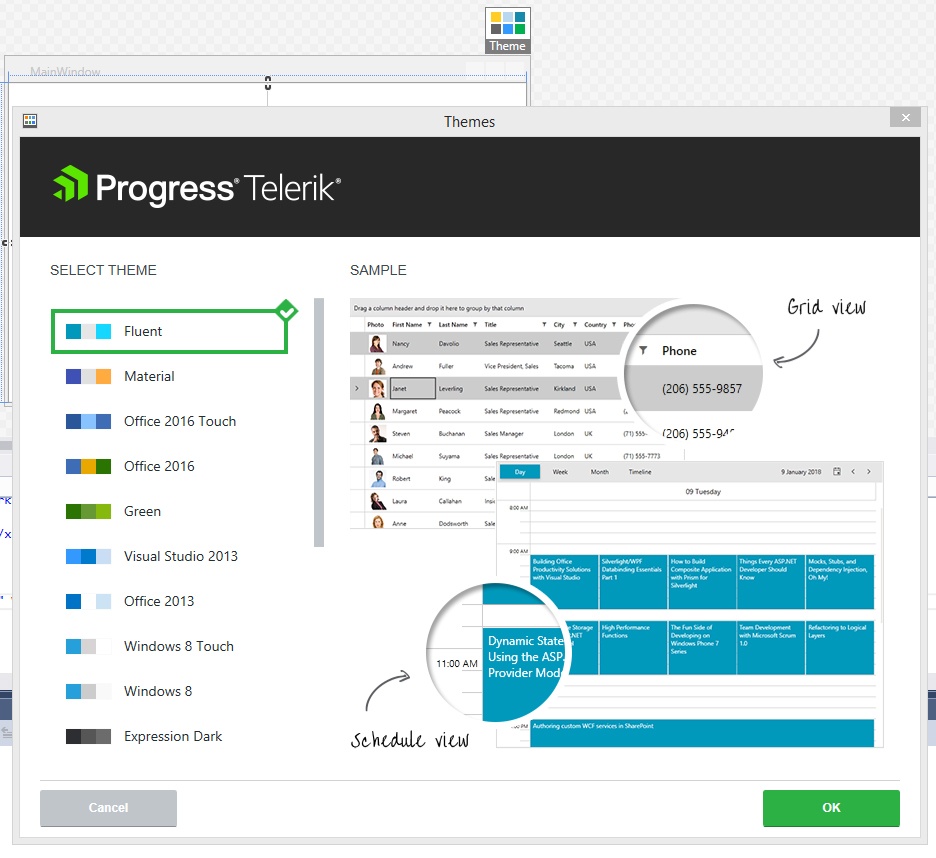
4. Press OK and you are set! :) Congrats!
On the other hand, if you are using StyleManager, then you will need to set one line in the code behind:
public MainWindow() { StyleManager.ApplicationTheme = new FluentTheme(); InitializeComponent(); }More information can be found in our help section on the Fluent theme.
Try it Out Yourself and Share Your Feedback
The team and I would love to hear what you think about the Fluent Design Theme in Telerik UI for WPF, so make sure to get the latest version and try it out.
We are anxious to hear (or see :) ) your comments, thoughts and suggestions in our Feedback Portal, or right in the comments section below. Additionally, you can also take a look at how the Fluent theme looks with our WPF Color Theme Generator tool or in our Demo App on the Windows Store.
If you are new to Telerik UI for WPF, please head over to the product page to learn more about the toolkit and what the full offering has to give.
That's all from me and I hope you found this article helpful!


