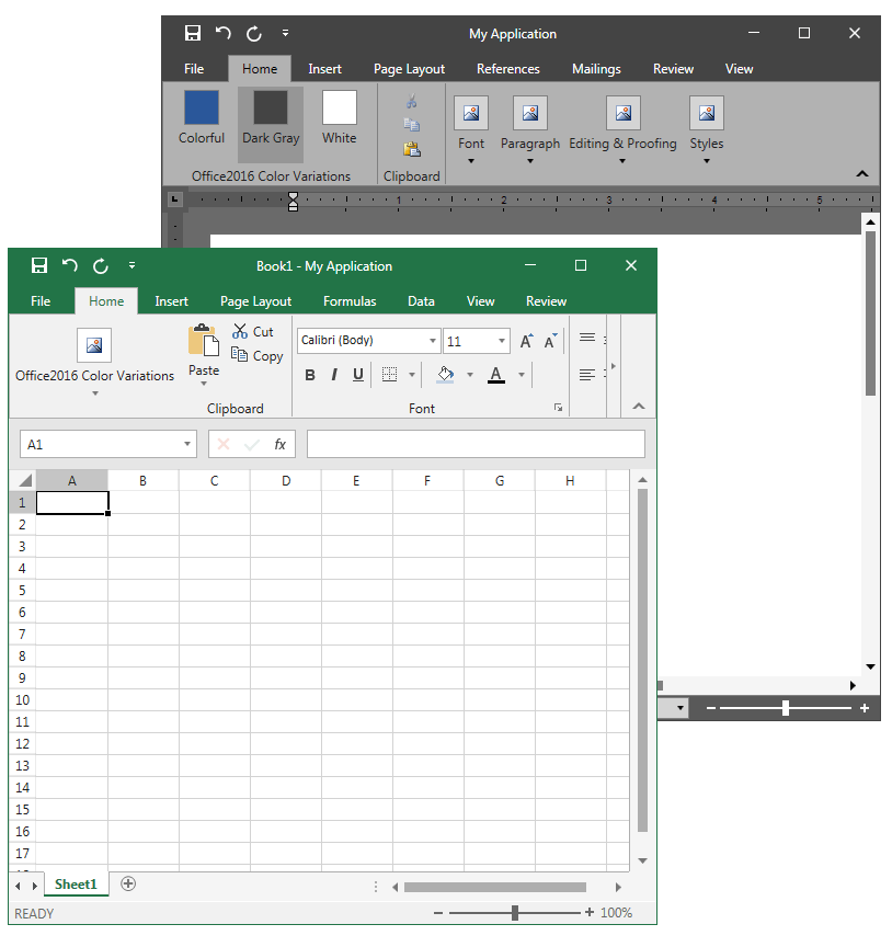
UI for WPF now brings a new Office 2016 look to some of our most sophisticated controls, giving you a sleek and modern look that is highly customizable.
RibbonView, RichTextBox and SpreadSheet Gain Office 2016 Style
A great app requires a great user interface. I’m pleased to announce that with R2 2016 Telerik UI for WPF now supports Microsoft’s fancy Office 2016 look for one of the most sophisticated controls (when it comes to styling) we have—RadRibbonView, RadSpreadsheet and RadRichTextBox.
Even greater, you can get a Windows10 OS experience by integrating these three controls with RadRibbonWindow, which can be styled in the Windows10 OS crisp design.

Syntactic Sugar
Though it's not quite a whole new theme, our Office 2016-inspired theme is based on our popular VisualStudio2013 theme, and therefore inherits all the goodness that comes with it (for example, you can dynamically change the FontSize and FontFamily as well as the default palette brushes that we ship with your own).
We support three color variations: Office 2016 Colorful, Office 2016 Black and Office 2016 Light.
We also wanted to provide the users an accent color preference, in the same way that Microsoft does with each Office 2016 major product they ship— a blue accent color for Word and green for Excel.
Digging Deeper
The current implementation (which you can freely download as a .zip file at the end of this blog) follows the MVVM pattern, and is pretty much based on changing the default VisualStudio2013 palette brushes to custom ones declaratively as well as the XAML custom markup extensions technique. We won’t go into detail on this, as it's a common approach that we've supported in all our latest themes since Windows8. If you are new to it I highly recommend checking out our documentation topics though.
Still, perhaps you're wondering what the custom markup extensions are for, so let me shed a light on this by digging deeper.
Due to the specifics of the Office 2016 look we needed more brushes that were control independent—for example, a specific brush for the Tab Foreground, Backstage Background, Ribbon Buttons MouseOver/Pressed Visual States, etc. Furthermore we wanted these brushes to be accessible in XAML and ‘sensitive’ to Color Variation change.
Wherever needed we used a simple implicit style with style setters or retemplated those of our controls templates that depended on the custom brushes. So in code we made our own Office2016Palette with the new brushes that are called in XAML via custom markup extensions. The custom markup extensions return shared static Brushes with their Colors bound to an Office2016 Palette. To bind to them in XAML we use the curly braces “{}” notation that tells the XAML preprocessor that it has encountered an extension and the preprocessor itself responds accordingly by evaluating the text inside the curly braces. For example:
<StyleTargetType="telerik:RadRibbonBackstage"BasedOn="{StaticResource RadRibbonBackstageStyle}"> <SetterProperty="Template"Value="{StaticResource RibbonBackstageTemplate}"/> <SetterProperty="Background"Value="{telerik:VisualStudio2013Resource ResourceKey=PrimaryBrush}"/> <SetterProperty="HeaderBackground"Value="{appearance:Office2016Resource Resource=BackstageBackground}"/></Style>Here's how our Office2016Resource extension looks in code (Resources is a custom enumeration of Brush names that we use):
public class Office2016ResourceExtension : MarkupExtension{public Resources Resource { get; set; }public Office2016ResourceExtension({}public override object ProvideValue(IServiceProvider serviceProvider){if(serviceProvider ==null){thrownewArgumentNullException("serviceProvider not found");}string propertyPath;if(Office2016Palette.TryGetResource(this.Resource, out propertyPath)){Binding binding =newBinding(propertyPath){Source = Office2016Palette.Palette,Converter =newColorToSolidColorBrushConverter(),Mode = BindingMode.OneWay};returnbinding.ProvideValue(serviceProvider);}returnnull;}}
At this point we should have everything fully customized and ready. But how do we change the Color Variations and Accent Color of our products?
Well, the base logic for changing the appearance of the application resides in the AppearanceManager class, and is based on switching custom implicit styles runtime.The AppearanceManager’s job is to remerge all implicit style files in the application’s global resources every time an Office2016 ColorVariation or Office 2016 AccentBrush changes (the Office 2016 ColorVariations and Office 2016 Accent Brushes, as their names imply, are enumerations that keep our desired Word and Excel based Accent Brushes and Office 2016 color variations). These style files are not only the ones that we ship by default with our VisualStudio2013 theme, but resource dictionaries that contain customized styles and templates needed for the crisp look of the controls where you’ll find the mentioned custom markup extensions.
You might extend the Office2016Palette with your own Brushes and apply them fairly easy based on this approach.
Give it a Try
Feel free to customize the attached Office 2016 Inspired Application to give it a personal touch, or you can completely replace the current brushes or styles with your own to create a unique visual experience. We’ll be happy to hear your opinion so please drop us a line here or in our support threads! Happy coding!
